
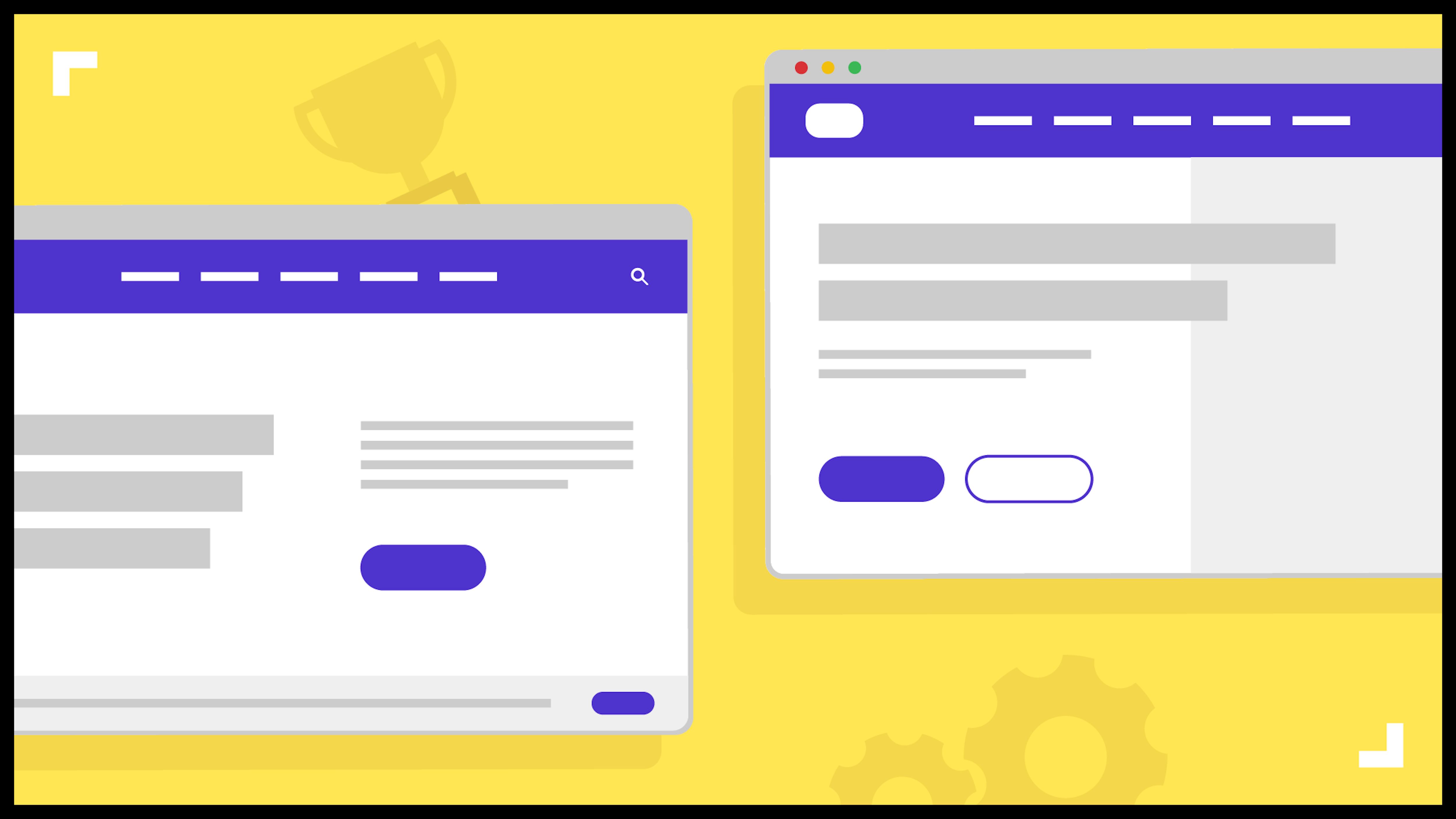
1. Get your value proposition right
Your brand’s value proposition should appear immediately on your homepage. It’s probably the first thing your web agency will design after the top navigation and logo placement, and has the potential to influence the entire website design.
In digital speak, your value proposition is made of three or four ingredients.
- Main title, the (h1) of page- a clear, concise headline that says what you do and what your potential customers will get from using you.
- A one/two sentence explainer paragraph - not always needed depending on how abstract your main title is. It’s a chance to elaborate on the what, why and how you do things.
- Visual element(s)- being your home page opener, you have a few seconds to capture someone’s attention. Your visual element needs to compliment the above-mentioned copy and put simply, kick arse.
- Call to action- in a world where everyone scrolls, this is perhaps not essential these days. However it’s worth considering. Adding a strong CTA to get people from your home page to a conversion point can work if the proposition and lead magnet is strong enough.
Brands that got it right
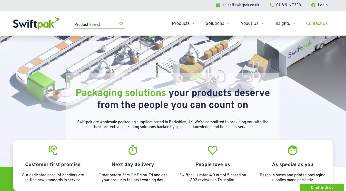
Swiftpak's homepage features a clear headline that says exactly who they are and how their customers will benefit from using their services.
They've also included an awesome animated element, which instantly grabs attention, as well as providing a visual explainer of their services.
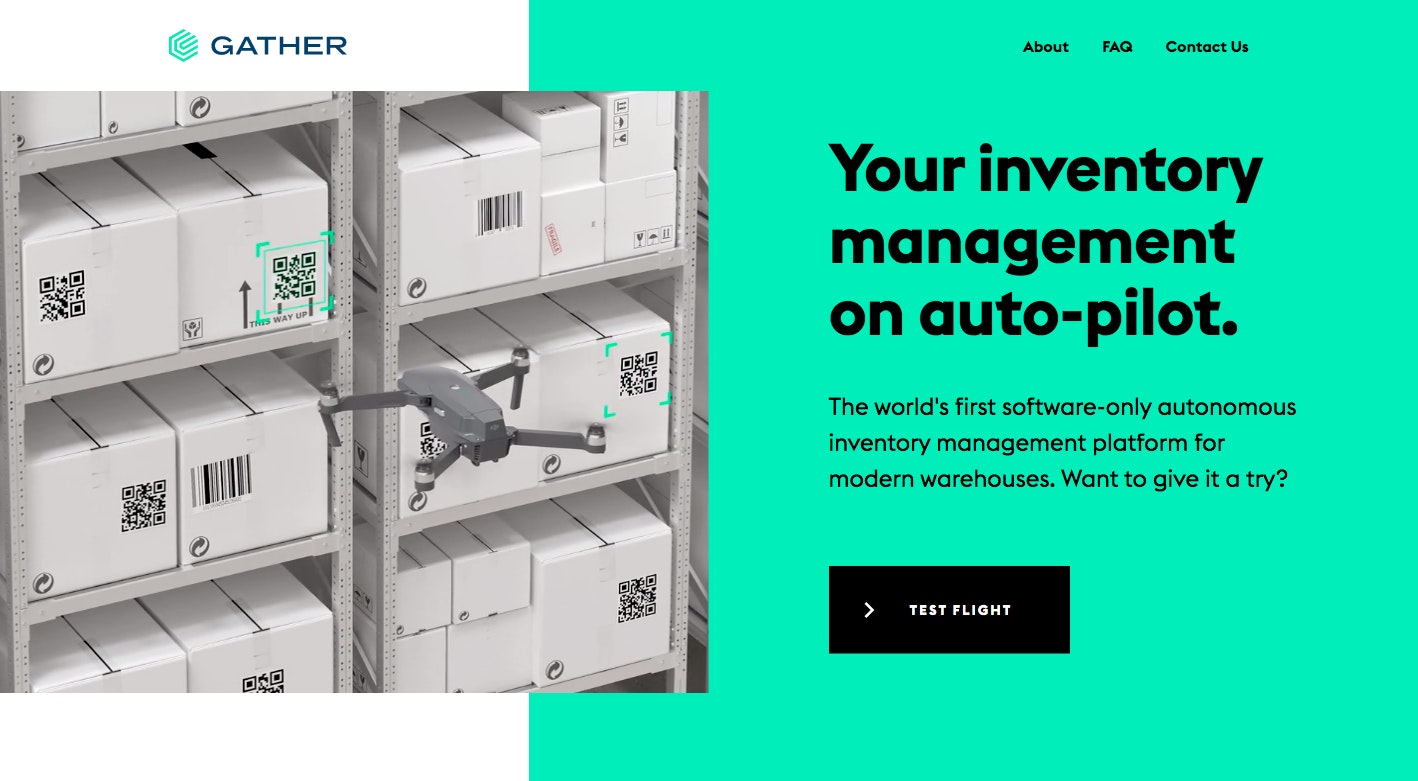
A favourite amongst our design team. We love the combination of colour, layout and video in this homepage from Gather.
Like Swiftpak, they have used an enticing visual element that instantly informs the visitor about what they do and how their platform works.
2. Be selective with stock imagery
Corporate websites and stock imagery have a love-hate relationship. There’s no denying stock images are useful, but don’t settle for mediocre.
We’ve all seen the same lady with a headset on a thousand different websites.
When time, budget or global pandemics get in the way of getting a photographer on board, define your stock image style early on and stick to it. There’s some cool, creative stuff out there that hasn’t been seen a thousand times.
Last note on stock images, and a personal pet hate. Don’t upload a stock image to your website with its original file name. It’s doing you no favours in the SEO department and makes it easy for competitors to find that image, and use it themselves.
Instead, rename it to something that relates to the area you are inserting it, add alt text and optimise the file size.
3. Don’t cram your navigation
The impact of the navigation menu is criminally overlooked. In reality, it’s a vitally important element of your user experience.
Back in the day, the approach used to be to have a main navigation that included every single category so that the visitor would be able to ‘easily’ spot what they were looking for.
The web design world eventually concluded that this doesn’t work, as this approach led to huge dropdown menus which makes for a poor user experience.
We know that visitors are time-poor these days. If they click on your nav bar, and a mega-menu drops down, they are going to leave. It’s your job to present them with the minimum number of options, but still help them find the information they are looking for.
Drop-down menus can still work well, if they are clear and simple. If you’re worried about people not finding the right information, don’t worry; there are other ways to get visitors to travel to a different area of your site, such as carefully placed CTAs.
4. Tell your story and show personality
Customers have more choice online than ever before. In a crowded market, personality can help differentiate your business from your competitors.
Personality also draws out an emotional response from the audience, which can help your brand to stick in their head. Whether that be a memorable slogan, humorous copy or creative imagery, it’s important to inject some energy into your web design.
Some business owners are surprised to realise that About Us pages are
This is your chance to really showcase your brand personality and show who you are.
Tell them about your history, changes that may have happened, what’s important to you, where you are, who you are. Show yourself, your employees and your office. People love faces and they want to see pictures.
5. Plan your website’s user journey
The key to any successful journey is knowing where you’re starting and where you plan to end up. The same goes for websites. To plan an accurate user journey map, carefully think through the path you want your visitors to take.
Gain a core understanding of your customer. That way, you can predict the actions they will want to take when on your website and make these available to them.
Understand their motivations, lifestyle, and pain points. Ask yourself questions like:
- What does this user want? How did they get here? Identify if they want to read something, call you, buy something etc.
- What kind of lifestyle do they lead? Are they a time-poor professional? This could give an indication as to how much patience they will have when browsing your website.
- How are they going to feel when browsing? Educated? Reassured? Understand whether your customer is carefully researching or making an impulse decision.
Also, avoid display too many distracting links. Instead, used carefully placed CTAs. Divide them into the following categories:
- Primary - A route towards the sales funnel.
- Secondary - Re-engaging a user that fell off-track.
- Single option - The final type. Offering a single option CTA that prompts action. CTAs like "Call us today" or "Download now" work well here.
6. Go bold with call to actions
Call to action buttons are all around us. We see them every day, but we rarely take action. The CTAs on your B2B website should utilise the following elements.
Be brave with your colour
It’s widely reported that shades of blue or green make great colours for CTA buttons, and colours like red and black tend to be less effective. But truthfully, the right choice is down to your site and your brand colours. Essentially, your CTA needs to stand out and look good.
Make your CTA buttons look like actual buttons
There's been a trend over recent years to make buttons look more minimal (thanks, Apple), but this can make it difficult to tell a button from a short snippet of text.
Make your CTA buttons stand out from normal text to avoid confusion.
Encourage action
Your CTA should literally tell the customer what to do next. A lack of clarity in what happens next can lead to a poor-quality conversion.
If a visitor doesn’t know what a button will do, it’s likely they’ll either avoid it or they won’t do what you want them to. Good CTAs usually contain words that encourage the user to act, such as "Download now” or "Start free trial”.
7. Create a lead capture strategy
Marketing automation can really work wonders when it comes to capturing leads. It’s a powerful way to engage with your customers. Automation can be designed to handle emails, social media and websites to generate and nurture leads.
You can enhance lead generation by ensuring that your website has lead forms and bold CTAs. Also, consider creating ultra-specific landing pages for your website. If you’re running a paid search campaign and you’ve got an ad running, you’ll need a brilliant and highly-relevant landing page to back it up and keep your visitors from bouncing from your page straight away.
Landing pages, forms and CTAs need to be well designed and clear. Keep your forms short and don’t ask for too much information, and you’ll increase your chances of conversions. Nobody wants to spend 10 minutes filling out a form!
In general, stick to the following advice. A clear, streamlined design will convert far better than a cluttered, confusing one.
8. Don’t forget about website performance
Two seconds is all it takes. That may sound like a knock-off lyric from Dua Lipa’s 2018 smash-hit, ‘One Kiss’, but it does make pretty good advice when it comes to best practices for a B2B website.
Every second delay in website performance can cause visitors to bounce from your site.
In fact, 47% of users expect a maximum of 2 seconds loading time for an average website.
Slow load times leads to frustrated visitors, which leads to high bounce rates and low conversion rates. So, make sure your web design agency is monitoring the speed of your B2B website on a regular basis.
9. Mobile experience is important (even if your audience uses desktop)
Even if you’re certain that your audience primarily uses desktop, it’s always worth putting some effort into your mobile experience.
“But is it really worth it?” you might ask. The answer is yes! 62% of companies that designed responsive mobile platforms for their websites saw an increase in sales.
Not only could you be significantly improving your conversion rate, but you’ll be doing yourself a disservice by not considering responsive mobile design. Google now evaluates the quality of your mobile experience when deciding where to rank your website in the search results.
Without a mobile responsive site, your business could be missing out on a fast-growing customer base - and Google will penalise you for it! It’s a lose-lose situation, so spend some time making your site mobile-friendly.
10. Don’t sit back after website launch
The work doesn’t stop once you’ve launched your new site. Websites aren’t there to just sit and look pretty.
Review your web design tactics often, always making an effort to ensure your website is the best it can be. Post-launch is the prime time to test, revise, learn and change.
Use data from tools like Google Analytics to analyse time spent on the page, conversion flow and bounce rate to compare how your website is performing pre and post-launch.
Websites are your most important tool when it comes to generating leads, so now’s the time to consider implementing a marketing strategy so you can get your website in front of potential customers and improve your conversion rate.
Finally, contact a professional web design agency
We've been designing brilliant B2B websites since 2005. If reading these tips have inspired you to improve your current website, get in touch. Our expert web design team would love to have a chat with you.