

Everyone remembers the story about Coca-Cola being green, then changing to that memorable hue of red. That colour is so tied to the brand it is almost impossible to imagine it in any other shade. In fact, colour increases brand recognition by 80%.

As websites are often the digital expression of your brand the same importance applies. The colours on your site should reflect and complement your brand’s colours. Before you get much further, the site and its colouring need to look good. Colour has a huge influence on that. Studies have shown that up to 90% of a person’s initial assessment of something (i.e. a website) is based on colour alone. Furthermore, websites also use colour to encourage users to commit certain actions or direct them to the next step or further information. Colour is a fantastic tool in a web designer’s arsenal to attract and control a user’s attention.
The Psychology of Colour
Now, before you get too excited, this isn’t going to be a deep dive into the human brain and how it interprets colour. There simply isn’t enough time or space on this page to give that topic the credit it deserves. What we will do though, is look at some common generalities in how humans react to colour and what this means for the web design industry.
Interestingly, although we commonly perceive colour to be a physical thing it is actually a psychological phenomenon and has much more to do with our brains than our eyes. How our brain causes us to react to different colours is in part due to universal evolutionary traits and also to specific cultural influences.
Although these traits are relatively specific to western cultures they are a good grounding for understanding how colour can influence people:
- Red: this colour represents love, joy, health and energy. Can also be used to signify anger – think STOP signs.
- Blue: generally considered to be a calming colour. Blue is relaxing. Can also be associated with trust and security.
- Green: the colour of nature. Used to evoke positive feelings as well as growth and harmony. In a modern context heavily associated with environmental topics.
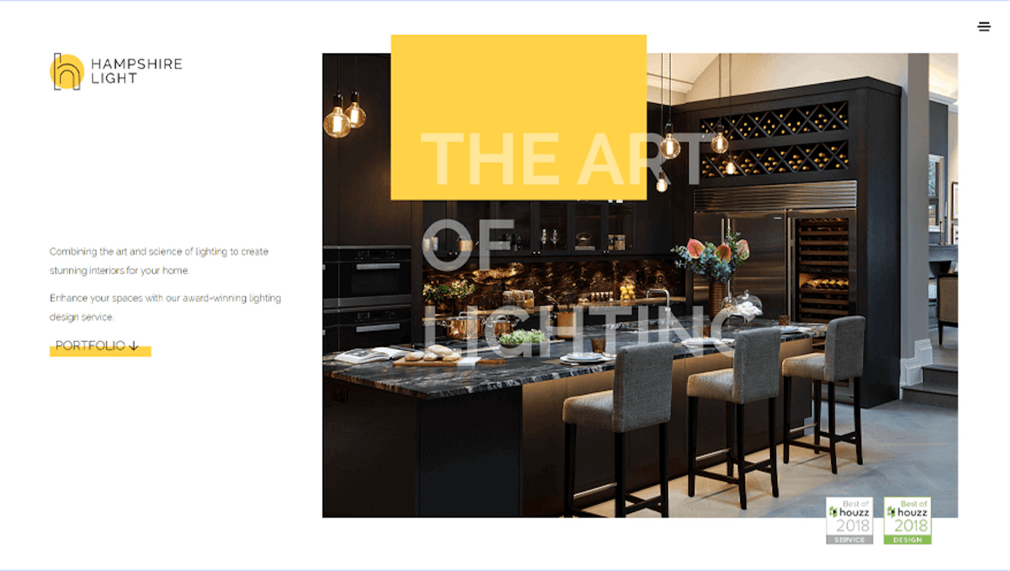
- Yellow: can be used to represent happiness and friendliness. Think of the sun and smiling faces.
In a digital context, colour has also been found to have differing impacts on the behaviour of online shoppers. Black is usually associated with products of a sophisticated nature, whereas Burgundy can convey that the product or service is rich or refined. Green, as we have already touched on, is a great way of signifying eco-mindedness and Orange is used to denote fairness and affordability. Blue remains a constant of trust and reliability. Although you may not wish to use this information to dive head-first into a total rebrand, it is undoubtedly useful if you have a wide and variant product range or you’re looking to take your e-commerce site to the next level.
Colour in Web Design
What does this all mean for the humble web designer then?
Primarily, the colours should be used in a way that is aesthetically pleasing and is enjoyable for users to spend time on and interact with. Largely, this is subjective. Some things just look nicer to some people. This is why good designers are in high demand and earn lots of money. They come up with ideas and put colours together in such a way that the rest of us wouldn’t have even thought of.
Secondly, the colours can also be used to portray some deeper meanings behind the brand or product, as well as influencing the mood of potential buyers. Your brand may not have green as part of your colour scheme, but if what you do is eco-friendly, you’d consider including some form of the colour on your site to denote this. Likewise, if you handle ID scanners for airport security, for example, you’d use blue to encourage feelings of trust, security and reliability.

Colour can also be used to improve conversion rates. The internet abounds with stories from hundreds of different companies who have changed the colour of CTA buttons from Red to Green and seen improvements anywhere in the region of 10-50%. These stories should be taken with a pinch of salt, of course, but the learning behind them is still valid. Again, a lot of this is subjective, and the only sure-fire way to find out is to A/B test it. Read our blog about how to design a website to convert.
Don’t Forget to Have a Bit of Fun
Because visual design is subjective it is nearly impossible to give out a set of concrete rules of how to use colour in web design. Colours also come in and out of trend so something we might laud as the best thing yet might be resigned to the trend scrap heap soon after. The importance of colour and the influence it can have on your users will not go out of fashion though. That will remain a constant for the web design industry. Great designers will carry on producing exciting new ways to use colour to grab our attention and we can’t wait to see where it goes.
We enjoy having fun with our designs at Bigger Picture and using colours in a bold and exciting way is a big part of that. We’d stress the same for you as well – don’t forget to be bold and have some fun with colour.