

Put simply, SEO looks at search engines and UX targets your website’s visitors, both of these factors share the goal of giving users an optimised experience.
Here’s how UX and SEO go hand-in-hand when optimising your website.
Page speed
Page speed has knowingly been a ranking factor for a while now. You simply can’t rank highly in search engines or provide an enjoyable user experience with a slow loading website.
Where does UX come into page speed? The answer is straight forward. Nobody wants to sit around waiting for a site to load, we have things to be getting on with. Did you know that 40% of visitors will abandon your website if it takes more than 3 seconds to load? With a site that loads quickly, you’ll give visitors an enjoyable experience and Google another reason to rank you highly – don’t ignore page speed. It’s key.
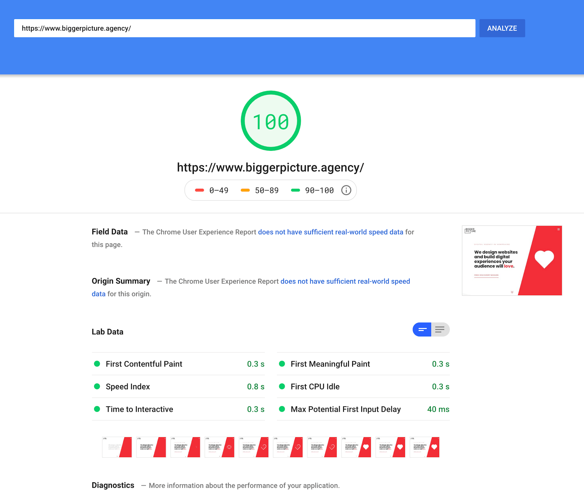
Google’s PageSpeed Insight tool is very useful. It allows you to enter your URL to not only see the overall speed of your site across both desktop and mobile, but a breakdown of data, opportunities and diagnostics. Take a look at how our website scores.
Mobile experience
We all know that mobile has grown rapidly, and continues to do so (54% of searches have come from mobile and tablet so far in 2019). Now, with Google’s mobile-first indexing, mobile experience is more important than ever. You cannot forget about it. Google webmaster guidelines states that: Google now use the mobile version of a website to determine rank on search their search engine result pages.
At Bigger Picture, we often hear people say, ‘it needs to be responsive’. However, this can’t be seen as just a tick-box exercise. There are ‘bad’ levels of responsiveness and ‘good’ levels of responsiveness, with many factors contributing to this. Is your text legible? Are clickable elements big enough? And what about spacing? All in all, make sure your site is an enjoyable experience on both mobile and desktop, your users will thank you, and so will Google.

The importance of site structure
A solid site structure gives your audience a pleasurable user experience. The more helpful your site is towards your users, the more appealing it is for search engines too.
Bounce rates contribute to how well your site will perform in Google’s search engine – the lower your site’s bounce rate, the more likely you are to appear for your target phrases. With a well-defined site structure, your visitors are less likely to become lost and bounce. Ultimately, reducing bounce rates will lead to improved rankings.
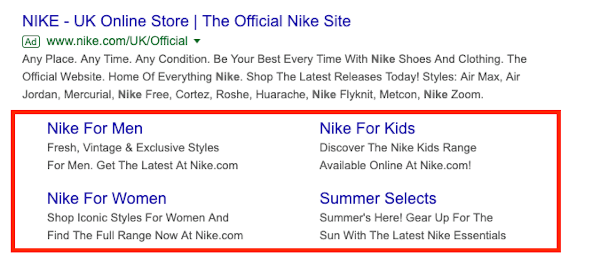
The structure of your site determines whether Google can display site links on their results pages. But what are site links? They’re additional links that appear below the meta description of a result in Google. This takes over more space on the results page, giving less room for your competition and generating more clicks for you. Win, Win.
Additionally, site links eliminate an unnecessary click for your visitor. If they know what they are looking for, they can use a site link instead of visiting your homepage – another way to improve user experience.
Take a look at what Google themselves have to say about site links…
“We only show site links for results when we think they’ll be useful to the user. If the structure of your site doesn’t allow our algorithms to find good site links, or we don’t think that the site links for your site are relevant for the user’s query, we won’t show them.” Site links are automated at the moment, but Google are looking to implement a webmaster input in the future. If you’re interested, check out the full details on how Google’s algorithm looks at sitelinks.
Accessibility
Accessibility is the practice of creating content that can be used and viewed by a wide range of people. Going beyond the use of screen readers, accessibility is making sure your content is easy to understand, read and navigate.
Colour contrast
You need to take into consideration that some of your visitors may be visually impaired. If the contrast of your site is insufficient, people that have problems with vision may find reading your content difficult. The World Health Organisation estimates there are 217 million people who fall under the category of having moderate to severe vision impairment. With this in mind, consider the contrast between text and backgrounds when designing your website. Both your visitors and Google will take note. To test your website, take a look at this colour contrast checker.
Readability
Search engines don’t take the score of your content’s readability directly into their search ranking algorithm. However, the readability of your content will affect how a user behaves on a page, and this is what Google is interested in. To improve readability:
- Use descriptive headings
- Simplify text
- Use capital letters sensibly
- Avoid decorative fonts and italics
- Avoid full width text
- Be generous with spacing
Readability should never take a backseat; apply these simple practices and you’ll be a step closer to creating that perfect user experience.
You can check the level of your site’s readability with a SEO Review Tools’ readability checker.
Alt text
Attaching alt text to images you upload to your site is important for a few reasons.
- Screen readers will read the alt attribute to help visually impaired users better understand an on-page image.
- Alt tags will be displayed in place of an image if an image file cannot be loaded
- Alt tags provide Google with better image context, helping with indexing your images properly
Using alt text on your images can make for a better user experience, but it can also help with your SEO efforts. Along with implementing file naming best practices, alt text offers another opportunity to include your target keywords. But be careful, only use target keywords where necessary, you don’t want to be penalised for keyword spamming.
Visual Priority
Google understands a page like a user would. Prioritising content visually will let Google and your users understand the order of importance. This can be done using h1, h2 and h3 tags inside the code of your website.
A single h1 tag should be used per page. No more than one. This tells search engines, as well as users, the page’s primary subject. The h1 tag is often the first piece of content on a page (page title) so usually the first piece of content a user will read. So, not only does the h1 need to be appealing to search engines (this can be done by adding keywords toward the front of the heading) but to users as well. This will ensure your visitor knows roughly what they are about to read.
Following the h1 should come your h2 tags to organise the rest of the page content. These sub-headers give both search engines and users additional information about what the page is about. You can use this header several times throughout a page and should use h3’s to further segment your content. Here’s an example of how this could be done:
- H1: The link between UX and SEO
- H2: Accessibility
- H3: Colour contrast
- H3: Readability
- H3: Alt text
SEO and UX equal Success
Hopefully, you can now see that SEO and UX go hand-in-hand when creating a successful website experience for both human visitors and search engines. Remember there will always be room for improvement. Always test the changes you make to your site, monitor the data and evaluate how these changes are performing over time. Good luck! (not that you’ll need it after reading this) If you have any questions, contact us and we’ll be happy to answer them for you.