

Responsive web design is a phrase coined by Ethan Marcotte in 2010. Doesn’t feel that long ago right, but for you iPhone enthusiasts out there, we’re talking iPhone 4 times. By 2012, responsive web design was a standard practice in the industry as mobile-friendly websites were seen as a must due to the growing popularity of mobile internet users.
But as we step further into 2025, is mobile-friendly web design enough? Imagine if the iPhone 4 was released today? Exactly!
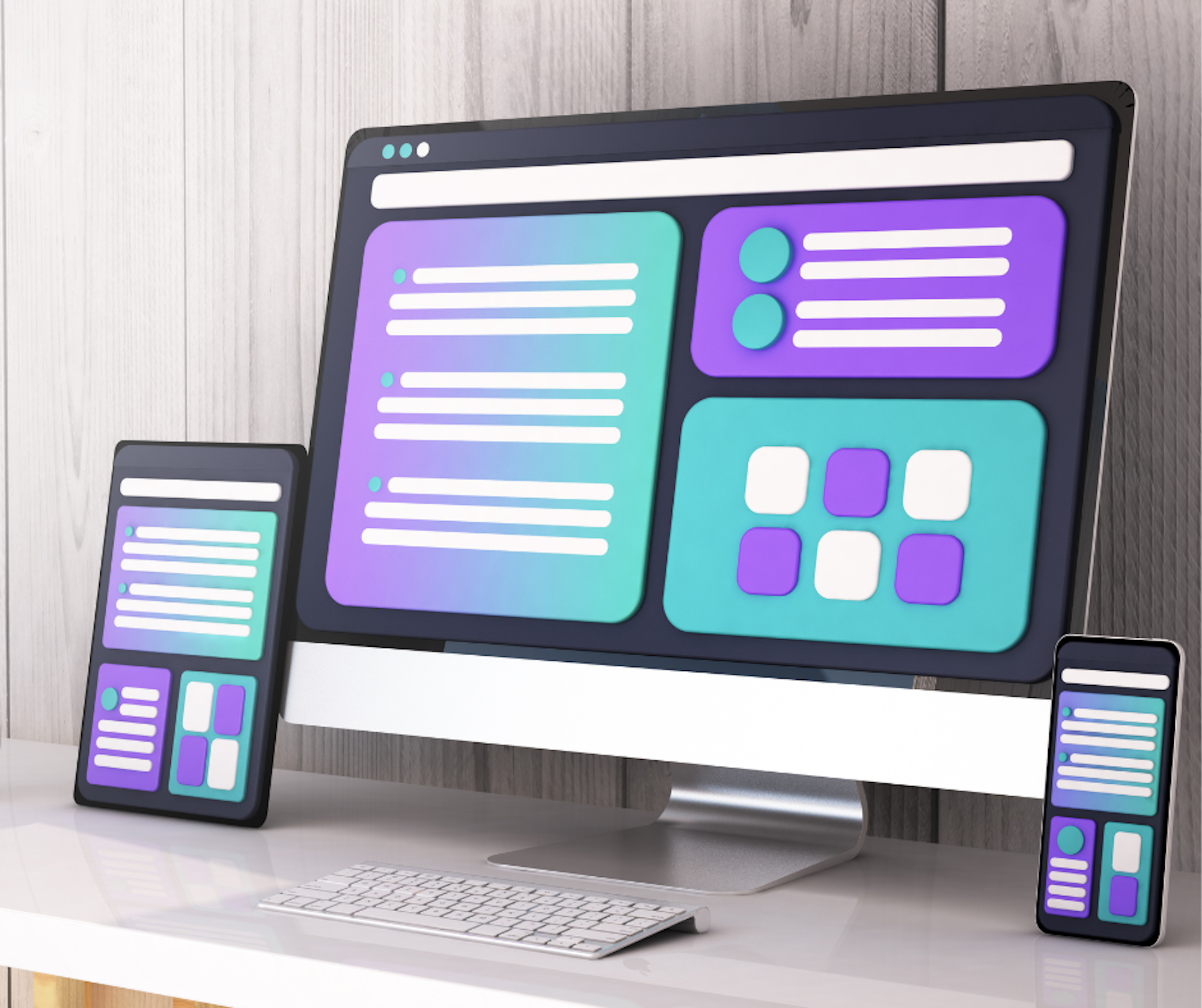
What is responsive web design?
Pre-2010 we created websites using tables, mostly at 800 pixels wide, optimised for standard 1024 desktop screens at the time. In 2011 Media Queries Level 3 was introduced, allowing developers to use media queries and different CSS rules based on the device that was rendering the website. It allowed developers and web designers to create websites that worked from mobile to tablet and HD 1080p desktop resolutions.
Frameworks like Bootstrap were born that made learning and creating responsive websites relatively easy by adjusting layouts, content and styling to fit the user’s screen size.
And now? It is even easier with the support of container queries in CSS. Developers can now create even more advanced responsive experiences based on a component’s container size, not just the viewport. What once required heavy JavaScript and nested CSS hacks can now be achieved with simple, native CSS.
Why modern websites need more than responsive design
Responsive web design remains a crucial foundation for modern websites, but in 2025 it is no longer enough on its own to ensure a site that is optimised, competitive and has a user-friendly experience.
We often see mobile-friendly, mobile-first or a responsive website mentioned on a project brief. We occasionally see ‘fast loading’ too, but that’s it. Sure, it goes without saying a website should be responsive and fast in 2025, but don’t make it a tick box exercise. It’s way too important, and there’s way more to it. Let’s dive into iPhone 16 Pro levels of responsive web design fit for 2025.
Why responsive design remains crucial in 2025
Mobile traffic dominates the web, making RWD a non-negotiable when designing a new site for reach and usability.
RWD ensures a consistent, professional appearance and user experience across smartphones, tablets, laptops, and desktops.

Going beyond responsive web design
Responsive web design has become the standard for creating websites that function seamlessly across different devices and screen sizes. In 2025 building a responsive website alone isn’t enough. Enter core web vitals - a set of performance metrics that go beyond the traditional focus on responsiveness and delve into real-time experiences of users interacting with your site.
Why core web vitals matter
Core web vitals directly correlate to user satisfaction. Sites that load quickly, respond smoothly and maintain visual stability are more likely to engage users and keep them on the page.
From a business perspective this means better conversion rates (CRO), reduced bounce rates and a higher likelihood of user retention.
Going beyond Lighthouse
When people talk about improving site performance, they often reference tools like Google Lighthouse. While Lighthouse provides valuable insights into accessibility, performance and best practice, it is important to think beyond the tool itself.
Real world metrics collected from actual users is critical for improving site performance. That’s where tools like the Chrome User Experience Report (CrUX) come in.
The importance of CrUX
CrUX is a powerful tool that takes data from actual Chrome users to assess how well your website performs in real-world conditions.
Unlike Lighthouse, which uses lab data from controlled environments, CrUX uses anonymised data from millions of Chrome users to give you insights on how your site performs for actual visitors. This allows you to analyse user experiences over time and across many devices and geographic regions. You can then pinpoint exactly where to focus your optimisation strategy and find areas of improvement that would otherwise go unnoticed.
Bespoke RUM solutions
While CrUX is invaluable, it shouldn’t stand alone. Consider using bespoke Real User Monitoring (RUM) solutions alongside CrUX. These tools allow you to:
- Monitor how your actual users interact with your site
- Identify what’s truly broken (not just what hurts your Lighthouse score)
- Prioritise real, experience-based optimisations.
Optimising for SEO and CRO
The data from CrUX is crucial for SEO and Conversion Rate Optimisation (CRO). Information about Largest Contentful Paint (LCP), Interaction to Next Paint (INP) and Cumulative Layout Shift (CLS) can help you decide if you need to optimise loading speed, responsiveness or visual stability. All of which directly affect SEO rankings.
CrUX data also reveals where users experience problems on your website. Such as:
- Slow loading times
- Confusing or unstable layouts
- Poor interactivity
This information is invaluable for improving the user experience and increasing conversion rates.

AI and Personalisation in web design: The new must-have!
AI and personalisation are becoming integral to creating dynamic, user-centred experiences. Gone are the days when a one-size-fits-all approach worked across devices.
AI enables websites to personalise experiences by adjusting text, images and even offers, depending on the visitor’s past interactions, without manual input. This makes websites more intuitive and user-friendly.
Light and Dark mode: Here to stay?
There has been a lot of talk about whether light and dark mode are here to stay in 2025.
Dark mode may have been considered as the alternative, not as frequently used version, but now 82% of mobile users prefer dark mode. People are often picking dark mode to help with eye strain, to save battery life and just because they prefer the look of it.
Switching between light and dark mode is more than just a trend. Being able to toggle between the two improves user accessibility, usability and personalisation.
The short answer is yes, light and dark mode are here to stay. Incorporating this in responsive web design is no longer optional in 2025, it is expected.
Progressive Web Apps: So yesterday
We’re huge fans of Progressive Web Apps (PWA) and continue to utilise PWA tech as standard in all of our projects. PWAs bring speed, offline access and app-like experiences to the web. You can read about PWAs and all their glory in our previous article.
Since then, Apple has been a little back and forth on their stance and let’s face it, if PWA compatibility does not extend to iPhones, their use is limited.
The good news? For now, at least, Apple reversed their decision to stop supporting PWAs.
PWAs are still worth considering, especially if performance and mobile UX are key goals. For a breakdown of what is currently supported on iOS, Brainhub provides a helpful overview.
Need some help with responsive web design?
Need help going beyond basic responsive web design? At Bigger Picture we have spent 20 years helping brands stay ahead of the curve. We have an in-house team of experts who know how to make your site look stunning and work flawlessly on every device.
Get in touch today to create a website that is beautiful, scalable, efficient and truly unforgettable.