

When we move to the website optimisation stage in our development process, my development team feel like that kid in the candy store. At Bigger Picture we are absolutely obsessed by performance optimisation, and we’ve got the awards to prove it. Every website we have launched in the past 6 months has been awarded with Mobile Excellence on Awwwards. In collaboration with Google, the awards recognise best practise in mobile site design and speed performance. One project recently launched for Hampshire Light managed to be featured as Mobile Site of The Week.
So there’s the proof we know a thing or two about website performance. Now here’s how you can make your sites load at the speed of light too.
Beyond minification
In this article we are not going to present how we mastered front-end performance by image optimisation, HTML minification and JS concatenation. Yes, all of them are very important steps and are fundamental in website performance, but I’m going to presume you get that and practise the basics. Like most things, practising basic techniques is not enough and to really achieve mind-blowing performance, you need to get creative.
PWA features on a traditional website? Why not!
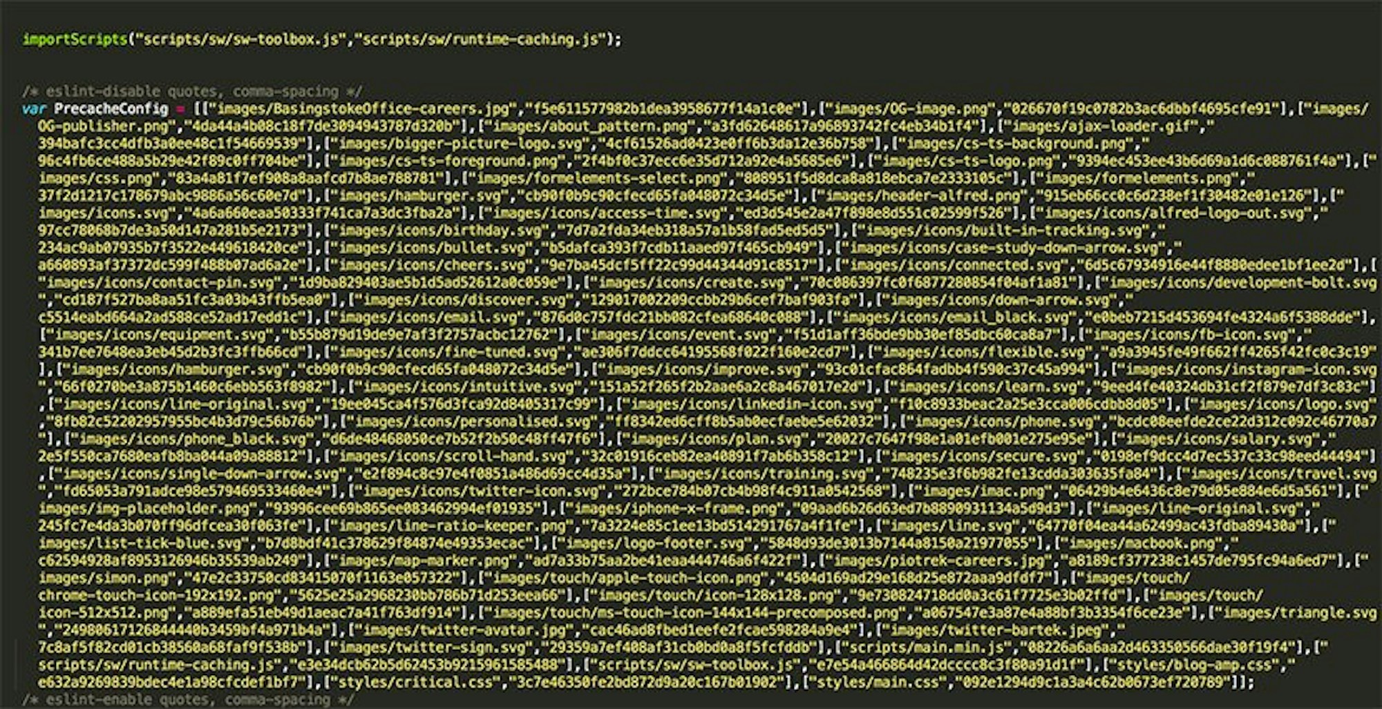
I recently wrote an article on Progressive Web Apps - check it out after this article. Since then we have been successfully integrating one of the most significant features in PWAs, a Service Worker. Although Service Workers are primarily for enabling a website/app to work offline, add to home screen or send push notifications, we use a Service Worker for traditional website performance. Using a Service Worker allows us to see if a static file (one that does not change often) is in the cache and serve it back from the disk. This means we serve up images, CSS, JS and videos much quicker than requesting it from the network. The list of assets to be cached is automatically generated thanks to our boilerplate based mainly on Gulp and sw-precache. If you are not too familiar with Service Workers there’s no better place to learn than the horse’s mouth. Go have a read of Matt Gaunt’s intro at https://developers.google.com/web/fundamentals/primers/service-workers/
Third Party Caching
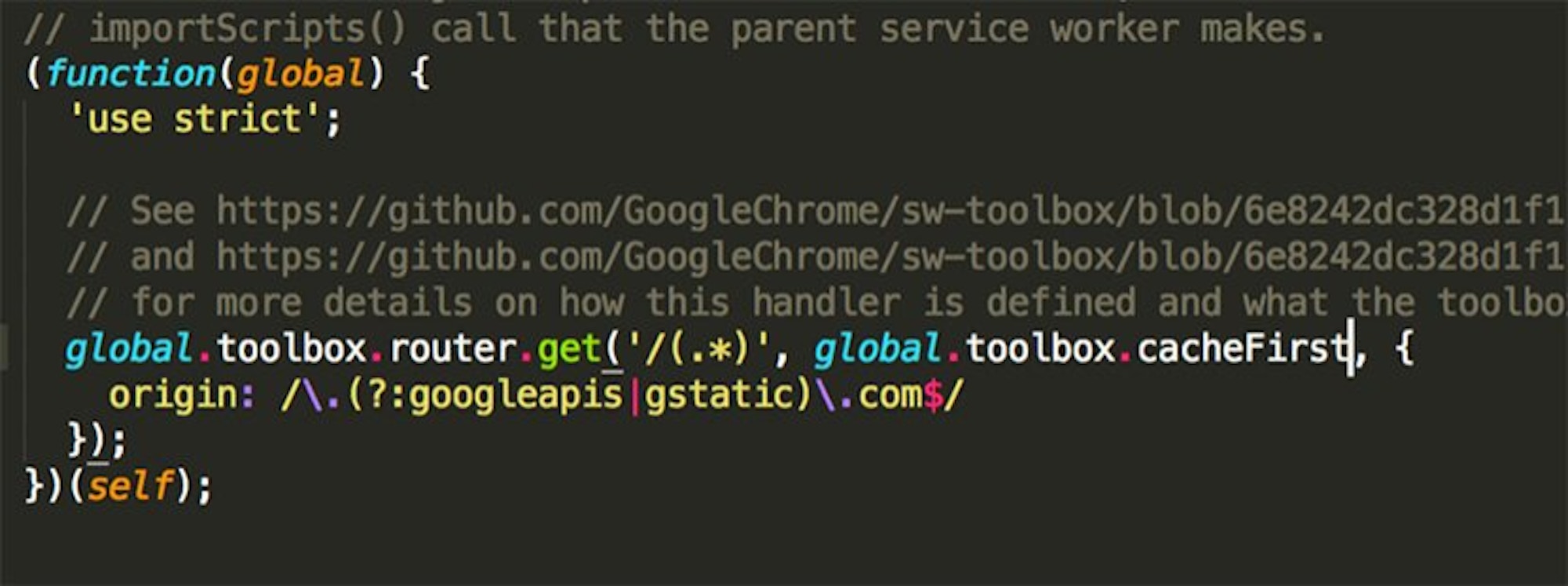
We cannot forget about sw-toolbox in our front-end boilerplate. It is a node module that is responsible for caching 3rd party resources that exist independently from the app shell. A good example of these resources are Google Fonts or Google Analytics scripts. As these scripts do not change (very often), we use a ‘cacheFirst’ handler. In other words, we cache 3rd party scripts via sw-toolbox.
The question you might ask now is: why do not you serve your websites offline? The answer is simple. Because they are websites! In most cases large, multi-language versioned, with loads of content, images and videos. If we cached all the inner pages a user visited in the session to make them accessible for offline mode, we would litter the users’ browser cache quota very quickly. It would make the browser crash. We’re currently working on a built-in solution for our Alfred CMS, to choose what inner pages should be available in offline mode with some limitation. Maybe caching just a few pages such as home page, main services and contact page is the best solution but we need to carry out some tests before we can recommend best practise in offline viewing for traditional websites.
So, in conclusion, using Service Worker features for traditional websites brings awesome improvement in website load speed. PWA or Service Worker features do not have to be limited to application development.
Critical Above the fold CSS
The term critical CSS or above the fold CSS is simply the stylesheet that is responsible for the appearance of a website before a user has to scroll down (above the fold). When you enter a website such as our own Bigger Picture site, the stylesheet responsible for above the fold is being loaded immediately in the HTML document. It means you do not have to download an entire CSS file to see one part of the site.
We simply load the most important parts of website with HTML immediately and load the stylesheet responsible for below-the-fold website appearance in the background, asynchronously, without blocking the rendering of the website.
How do we load the main CSS for the below-the-fold parts of website? Code snippet below.
Web Fonts loading strategy
We love original web design and in most cases we use custom fonts rather than pre-installed ones on your machine to make things that much more memorable. We use things Google Fonts, Typekit or buy licenses. It is crucial to choose the right decision to load them with the best experience in mind. Fonts are typically large files, contain glyphs or extra features (that are never used in most cases) so loading them without blocking rendering is very important. We normally choose the async loading method of web fonts on any site, but it all depends on the design and the animation idea too. Loading fonts in async way can cause the flash of incorrect font style (incorrect = the default font type which is the first locally installed font that is available on your machine in fact). And this is the moment where animation of text can help a lot. If you go to Bigger Picture, Hampshire Light or Pavilion websites, you can see that the text - loaded fast - appears with animation (simple fading in animation), with a subtle delay. It gives the font a chance to load and removes the annoying and ugly blip you see on some sites. Because of async loading, it does not block the website rendering too. As fonts are loaded, we never load them again thanks to the service worker and Barba.js.
Barba.js
We are unconditionally in love with Barba.js. It is a perfect JS library that helps in creating smooth transitions between our website’s pages.
Why Barba.js rocks!
- It minimises requests on website - HTTP network requests and requests to read assets from cache etc. If you go from home page to some inner page, or from inner page A to inner page B, it loads only the content and keeps the parts of website already loaded (such as top navigational bar or footer) without loading them again. The same thing is true for loading global CSS stylesheet, JS scripts etc. Clever? Clever!
- Prefetch, prefetch, prefetch - It loads the page you want to go to before you even click any link. On hover state of a button or nav item, it silently loads the page, making it visible for you right away after you make that click. It’s the built-in feature of Barba.js we really love!
- Script execution - Do not worry about 3rd party script actions such as Google Analytics tracking (which is normally fired on page load and not on dynamic transition with Barba.js). On page transition we are able to execute any script we want such as tracking page view, contact form submission and whatever else we need to do to make your site work.
- Looks sexy - The possibilities to adjust page transitions are unlimited. We can build the most creative or subtle effect we want.
Asynchronous loading
The main thing in loading JS or CSS asynchronously is to allow the browser to start rendering the page before the JS or CSS is fully loaded. As we do not worry about IE9 support these days, we just use ‘async’ attribute to load main JS file.
As I mentioned before, we load CSS asynchronously too. If you would like to see a real example of how big an improvement the async loading is, please take a look at the 2 screen shots below. On the first one, you can see how CSS and JS are being loaded in synchronous way. On the second one - in asynchronous way.
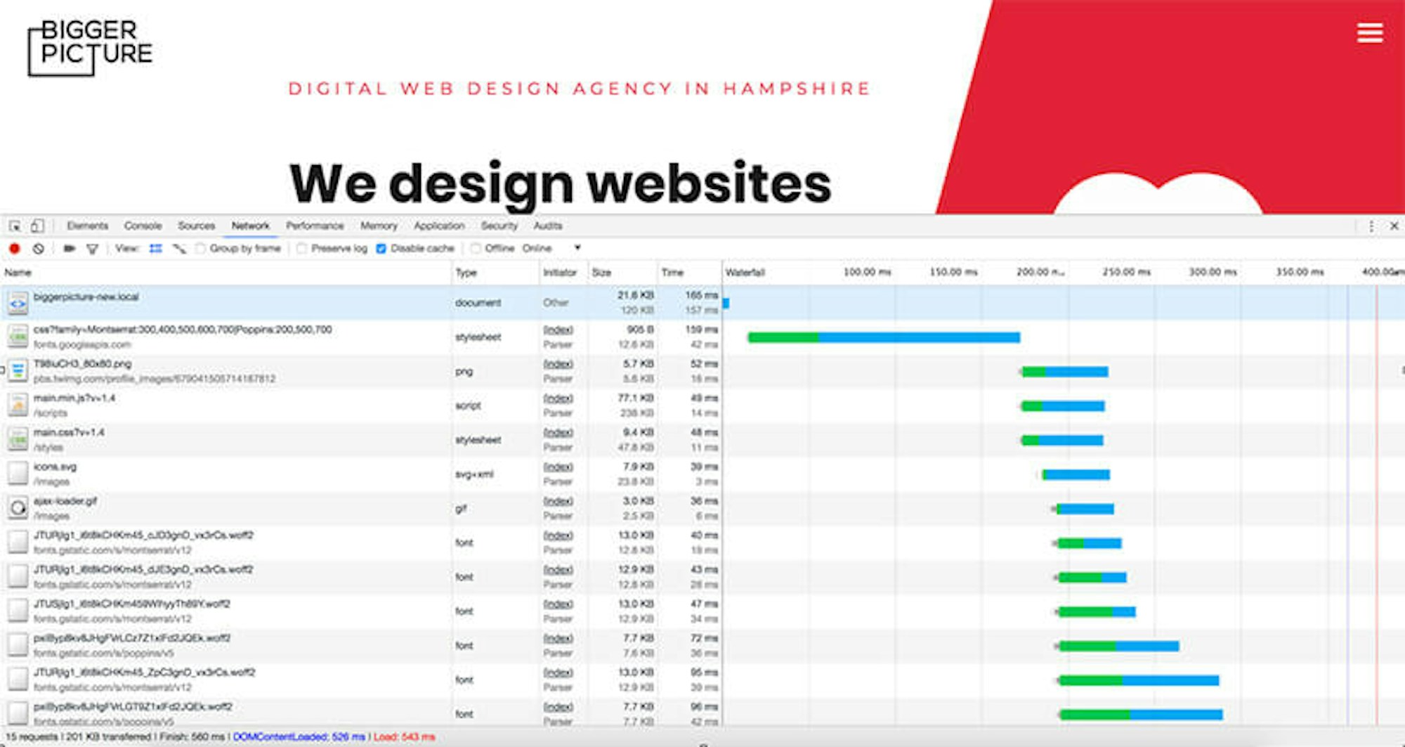
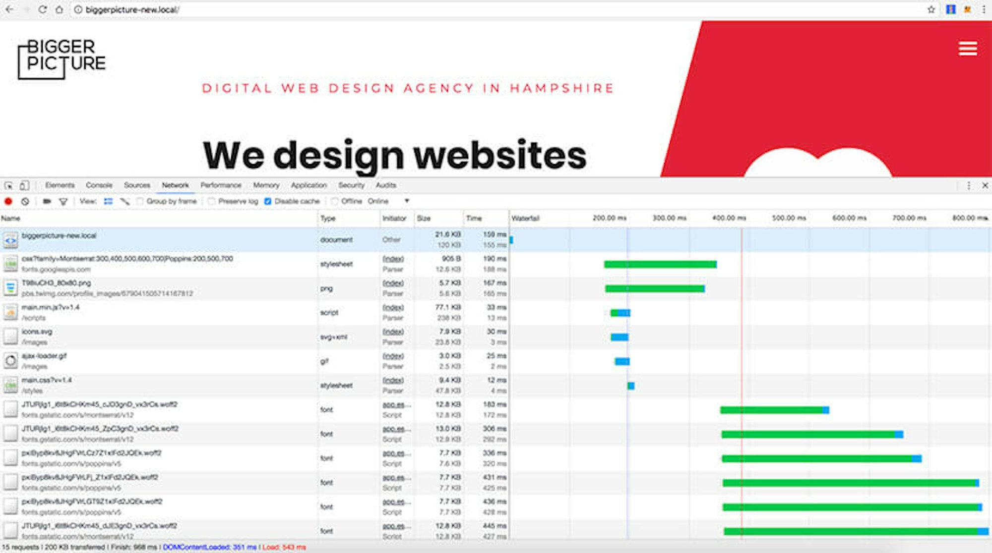
Can you see the difference? Pay attention to the blue line - it shows when the DOM was loaded. In reality it means when the user started seeing the website. You could say, well, it is about 150ms difference between the 2 results which is not noticeable to the eye. This is seriously wrong thinking! If you go to a page for the first time, and/or on a slower internet connection, it makes a big difference in user experience. Trust me!
Loading images or 3rd party components on demand
Long scrolling pages are not going anywhere in web design. Especially relevant for case study style pages, where you have a lot of content to load (images, videos etc), loading images on demand, or ‘lazy loading’ as its called, is used to only load things you can see as you scroll down the page, avoiding a long and clunky load of an entire page before you (as a user) are even ready to see it.
Take a look at the video below - the images are being loading while scrolling down.
The same solution was successfully used for loading 3rd party components on site such as Google Maps. If the map is below the fold (to see the map a user has to scroll down), we only load the map when the user is ready to view i.e. scrolled down to the map section. Take a look at the video below and note how the map images and scripts are being loaded on demand while scrolling down to the section.
AMP
You may have heard about the AMP project and how publishers of content are utilising almost instant page loads. We are a big fan of this solution as it’s not only great for the overall user experience, but it gives your content an SEO boost too. Google is all about mobile and speed right now, and AMP is their solution we can all benefit from. What is the AMP page in fact? It is a micro site focused on fast delivery of content for users, driven by Google CDN and cache. It is a project focused on speed and very high performance, to display useful information, articles, e-commerce pages and more very quickly thanks to Google technology. To build an AMP page we need to follow very restrict rules prepared by Google, using their components. All is oriented for speed.
We have been building AMP pages mainly for blog article pages on our clients’ websites and the results are very positive. We were able to place our own blog pages really high on the search results for mobile users using AMP technology. We've also implemented e-commerce/product pages but it's a bit too early to comment on results.
I would like to mention we have a great AMP integration with our in-house engineered CMS, Alfred. Every new blog article added via the Blog module in Alfred makes an AMP page automatically generated thanks to AMP PHP Library we use. The default HTML generated from WYSIWYG editor is being converted to HTML that contains AMP tags, for instance <img> into <amp-img> and Youtube <iframe> into <amp-youtube>. Everything is totally automated and fully valid.
Server-side settings, HTTP/2, CDN
The front-end and back-end optimisation process is where we spend most of our time however it would be silly to forget about the server or web services responsible for serving the website.
We mainly use Nginx for our web servers these days but we historically used Apache. Benchmark tests showed a big dominance from Nginx over Apache, at least for our kind of sites. The new-ish ability to enable HTTP/2 protocol helps us to take other benefits too. Our website loads faster due to single connection per server (instead of one connection per request) and is great for a mixed content web page containing a mix of HTML, CSS, JS, videos, images and so on. There are a lot of other benefits from HTTP/2 which I’ll cover in a near-future article.
We cannot forget about setting basic headers such as expires, cache-control and max-age to help to cache static resources on a website and deliver them to user faster. It takes a minute to implement if you know how to develop so these are super quick wins.
Content Delivery Network services we tend to use are Cloudfront or Cloudflare. Both are used for full site delivery and not just image delivery i.e. a user who goes to biggerpicture.agency connects to our website through Cloudfront CDN which in turn reads the website from our origin server and caches its assets. It really helps to load the website faster in every corner of the world and provides additional security features like firewall. Sweet!
Back-end optimisation
Our Alfred CMS is built on top of the Laravel framework. Using a ready library or solution does not speed is taken care of automatically though. Any ready tool or framework needs to be used in the right way.
For better performance we focus mainly on:
- SQL queries optimisation
- Caching
- Output minification
For query optimisation we use Laravel Debugbar - it tells us how many queries to database we use on any given single page and shows how we could improve it, minimising the number of requests. We try to cache as much of the data as possible too. The output needs to be minified to bring the server response time as fast as possible, ultimately starting the front-end rendering faster.
Final words
The process of website performance optimisation goes beyond what most web design agencies do as standard. Maybe because they can get away with it or maybe because they don’t get it themselves. Who knows. It’s not simple and it takes time but I feel it is an essential part of the development process. If we can spread the word and get more people understanding web performance we can make it a faster, more enjoyable place for everyone.
Anything to add to this article? Want my team to make your site load faster than anything you’ve seen before? Have a question? I love nothing more than talking development so ping me a message via our contact page and let’s talk.