

BOOST YOUR CONVERSIONS BY 30% TODAY
Ok, so that was quite a basic example, and probably isn't going to win at the Cannes Lions any time soon but it serves to demonstrate what a call-to-action (CTA) is.
A CTA has one, very specific, goal: to convince users to literally take the action you want them to, be it adding an item to their cart, downloading a resource, or filling in a form. While a CTA is usually seen as the final part of the user's journey through the landing page, it can exist at several points along the user journey, giving the user ample touch points to complete the action you want them to when they're ready to do so. It's vitally important that all of your marketing elements have a CTA, from your web pages (and their meta descriptions), to landing pages, to emails, to social media profiles and posts.
One depressing fact that a decade of experience has taught us is that there are legions of copywriters, marketing gurus and so-called "engagement experts" who just don't understand the power of a properly optimised CTA. A CTA is one of the most important elements of a high converting page. For example, in 2003 Unbounce.com changed one word in the CTA on one of their PPC landing pages, and almost instantly received a 90% increase in CTR, which isn't to be sniffed at.

To help you on your journey to creating kick-ass CTAs and booting your conversion rates, we've broken down our years of experience in making high converting websites and the CTAs that reside within them into a few basic steps.
POWER WORDS
Power words are, quite simply, words that trigger emotional reactions in their readers. Words like "because" which stresses that an action must have a result, and "you" which puts the onus on the reader are among the most powerful words in the English language, and are frequent staples in CTAs. "Free" deserves a mention too, owing to its position as one of the most influential words ever, for obvious reasons.
In 1963 David Ogilvy, regarded as the Father, Son and Holy Ghost of advertising wrote his list of the 20 most influential words in advertising. They were: Suddenly, Now, Announcing, Introducing, Improvement, Amazing, Sensational, Remarkable, Revolutionary, Startling, Miracle, Magic, Offer, Quick, Easy, Wanted, Challenge, Compare, Bargain and Hurry.
Although things have changed a bit since 1963, and the words that move us with them, the principle remains the same. There are still certain words that, when added to a blog title, social media post, page strap line or CTA that are certified to increase engagement and play on the emotions of your reader. We've listed a few below for you by theme, but bear in mind that the list is by no means exhaustive and, to get the best result from your audience, continual A/B split testing of different content and design options is highly recommended.

URGENCY
People are busy on the internet. It's no secret that, in the digital age, we're more connected than ever before and are constantly bombarded with stimuli, resulting in much lower attention spans, especially in younger, digitally native, generations. It makes sense then to play up time sensitivity in your CTA. The best, and easiest, way to do this is to tap into your reader's sense of urgency by inviting them to do whatever action you want them to do right now.
It's worth noting here that there are two kinds of urgency broadly speaking; real and implied. Real urgency, for example, is when an offer expires in 24 hours and, after that point, will not exist again. Implied, by contrast, is essentially the practice of using words like 'today' and 'now' to get your readers to take action.
However, bear in mind that implied urgency is only effective in a CTA when combined with all the elements that make a good CTA great. It's not enough just to stick words like 'now', 'today' and 'instantly' into your CTA and wait for your conversion rate to go up, you need to bring together aspects like:
PLACEMENT
First things first: bigger is better. No-one's going to notice your CTA if it's tucked away in a quiet corner of the page. Place it centrally and make it too big to miss. Simple psychology again, but if you make things too big to be ignored, then they won't be.
Be careful of making it too big, but make sure it's noticeable. Of special importance in the advent of mobile browsing is making sure that your CTA button is big enough for someone's thumb, Apple recommend having a tap size of at least 44px.
You can even add directional clues, like arrows or pathway imagery, to direct users to your CTA if you feel that it needs additional signposting. You don't just have to have one CTA on your page either (although with emails you should only ever have one, any more is overkill), you can place CTAs at several points during the user journey, one every section so that, when the user is ready to take action, they can.

You can also have two CTAs next to each other, forming primary and secondary options. The primary is normally the 'hard' option. It's the buy now, sign up, download or add to cart option that comes first. The secondary is always softer, and should offer the resources needed to make the prospect back to the primary CTA, as aptly demonstrated by the image below, taken from one of our projects.

COLOURS
The psychology of colour is also a huge part of your CTA, in that the "click now" "buy here" or "sign up" button needs to vividly stand out from both the surrounding content it sits in and from the rest of the page again.
Another big aspect of the design is making the button clickable. Elements like contouring and shading help to give the impression that your CTA button is a real, tangible object and, when paired with a simple CSS click animation, makes the experience feel immersive to the user.
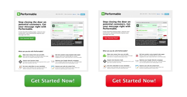
The above is a clear example of how colour can affect conversions. The image on the left is the original CTA and it's fairly obvious that the rest of the page is geared up towards a green palette, which you think would make sense right? From a continuity point of view it does, given that all the colours fit into each other. However, it doesn't stand out, unlike the red which provides a clear contrast and gives the CTA prominence and immediacy.
Once you've got your killer content and awesome, arresting design nailed the next step is to:
TEST SEGMENT
You should really work up a few CTAs, all with different wording and elements and, once you have, you'll want to A/B split test them against each other. Think of this as a continual process of improvement where you keep tweaking and testing until you find a CTA that performs above the rest.
You can also segment your CTAs for your various audiences, so your visitors see one thing, your leads another and your customers yet another. Truth be told, this is something only recommended for the seasoned marketer as, to do this, you will require enterprise-grade marketing software, like Marketo RTP, but can be a powerful way to remarket to customers and nurture leads.
Over the years CTAs have changed, as our views on content and design best practice change, but the endgame remains the same: put the right thing, in front of the right people, at the right time. A properly optimised CTA, built for its target audience, is a powerful tool in the digital marketer's arsenal and will drive your conversion rates up and up. If you're reading this and it sounds like news to you, then it's probably time you gave your own CTAs an update. Or, if you'd like the expert touch, get in contact and let us show you how we can help.
Image sources:
- http://contentverve.com/10-call-to-action-case-studies-examples-from-button-tests/
- http://www.helpscout.net/blog/psychology-of-color/