
Entrepreneur Seth Godin once said, “in a crowded marketplace - fitting in is failing.” In fact, he even went so far as to claim, “not standing out is the same as being invisible.”
He also said a lot of other brand-savvy things, which we might quote further down the line.
But for now, we’re going to stick with this thought because, as a team of award-winning web designers, it got us thinking. The internet is the most crowded marketplace ever to exist. It’s noisy and rowdy, where business shout over one another to win the attention of rushing crowds with far too little time and too much clickbait. But, amongst the raucous, it’s also a place of stock, mass-produced websites riding waning trends rather than setting new ones.
Going bold with your web design creates an experience that snaps visitors out of their ordinary, passive browsing habits, caused by all these websites looking and acting the same. Bold design weaves an elaborate story that pulls visitors down a perfectly-branded rabbit hole. Here is the gist of the plot...
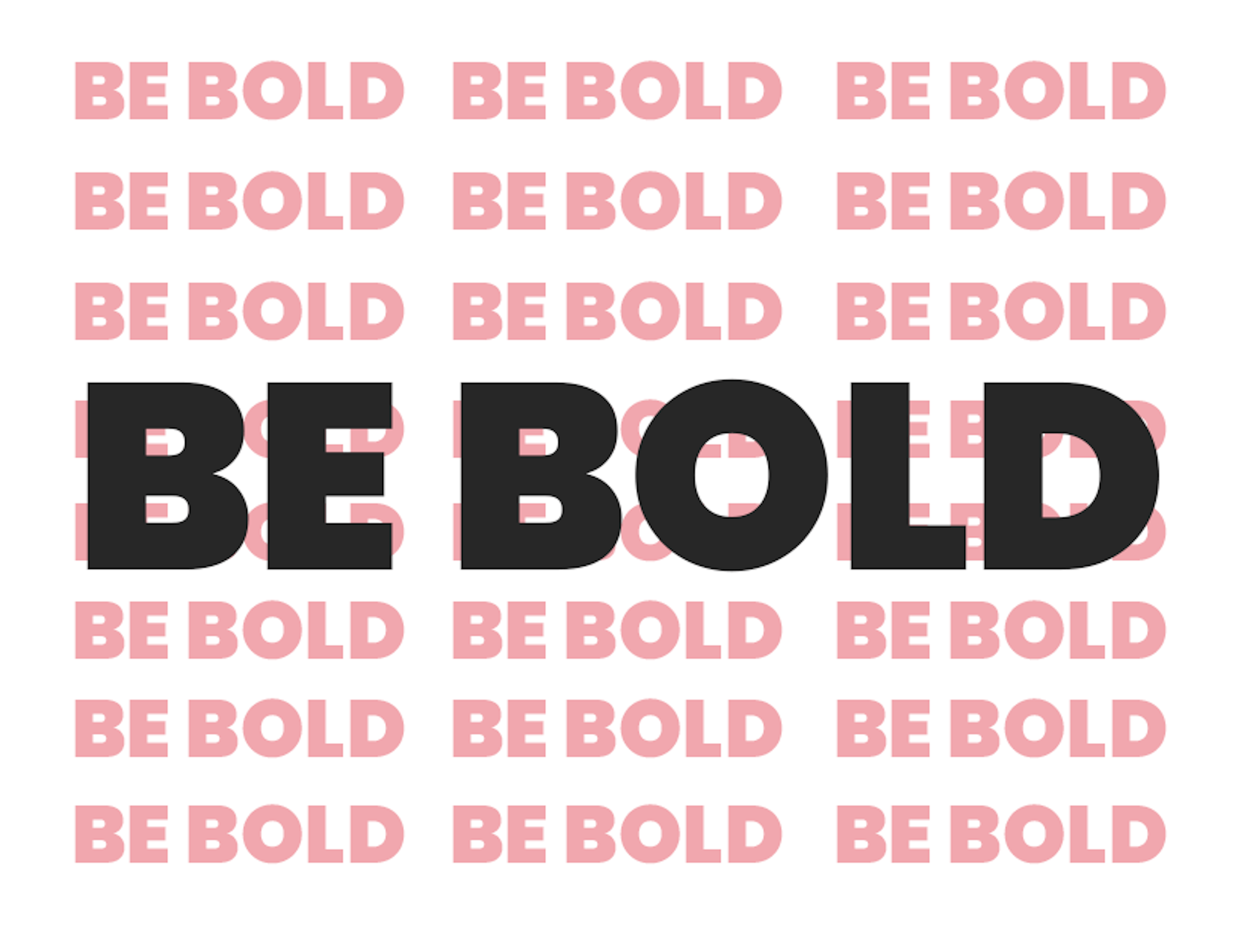
The Risk of Sameness
(To set the record straight, we’re talking more than bold font-weight here.)
In today’s digital world of template-driven, generic Content Management Systems, most people are aiming for “good enough” when it comes to their website.
That’s because these platforms - easy to use, affordable and readily available - are well, simply just good enough. They do what they say on the tin. But the problem is, everyone now has the exact same tin. E-commerce websites are popping up all over the internet like mini-carbon copies of industry giants such as Amazon and eBay. The theme and template market is booming too, and designers mimic the top-selling ones to capitalise on the trend. If you’ve seen one, you’ve seen them all with their feature, fit-to-width stock image and centred text, followed by miles of scrolling that reveal … more fit-to-width images with centred text.
Often the word “bold” can trigger a ripple of anxiety down the spines of business owners. This is because, despite the maverick stories we like to tell ourselves, we are all creatures of habit. We seek at all costs to avoid risk of any sort, to head instead for the shores of what we already know.
But the reality of the situation is - it’s not boldness, but rather its artless opposite, that is always the riskiest strategy of all.

Bold Ideas Require Daring Design
When Thomson & Scott came to us to help transform their website, we knew they wanted us to go where no man’s gone before. Thomson & Scott are game-changers in the wine industry, seeking to completely disrupt the way things are done. They needed a website to reflect this. And that meant going bold.
Just like industry disruptors, web design pioneers break old, outdated habits and bring new aesthetics and ways of talking to the playing field. They look beyond the limitations of their craft and find influences in things like modern art, contemporary culture and architecture, truly redefining what web design can be.
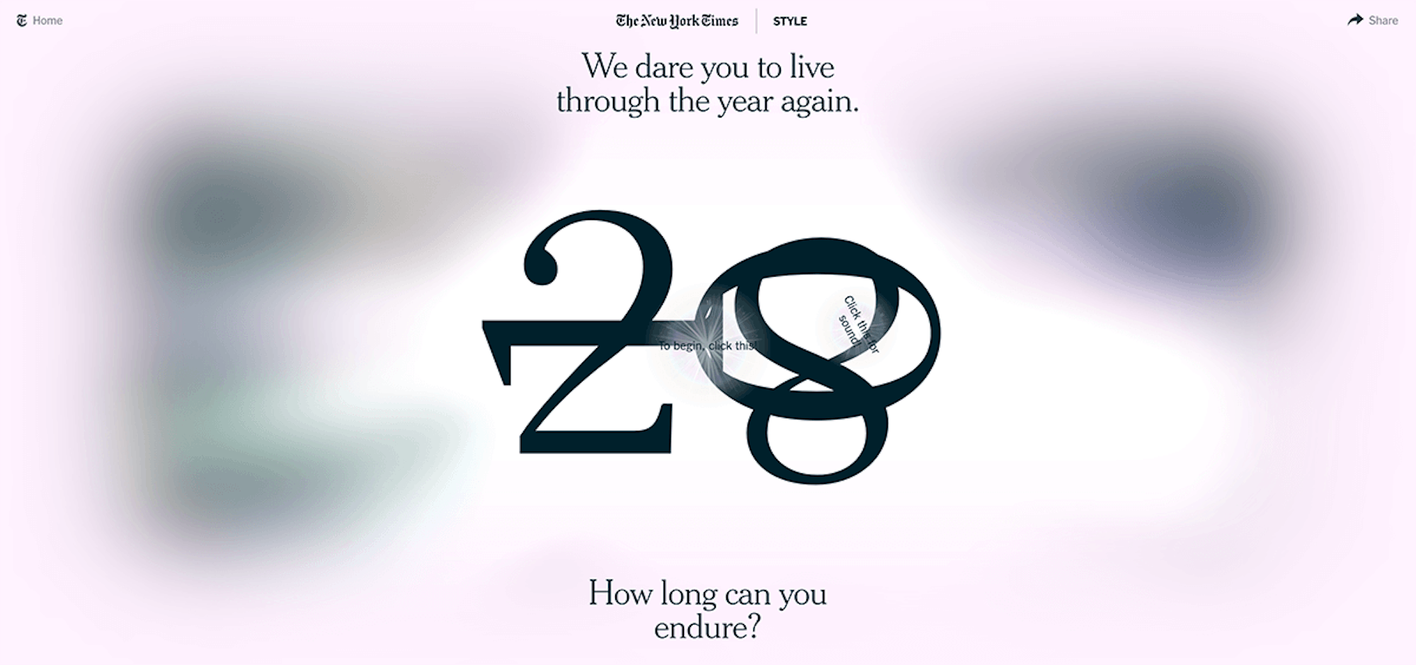
Take, for example, the Marmite-esque “web design brutalism” - a rough and rugged aesthetic with loud colour combinations, inspired by post-WWII architecture and which you either love or hate (thoughts?). Other websites, with their glossy, minimal designs and striking, oversaturated photography, feel as though you’re flipping through a high-end fashion magazine rather than browsing the web.
Quick Tips to Be Bold in Your Web Design:
- Design like you don’t have to code - Start with the Bigger Picture (branded-pun intended) first - the idea, the feeling, the vision of your brand. Then begin to fit your code around that. If you start with a focus on coding limitations you’ll quickly slip away from bold territory and the fearsome risk of sameness will set in. Start out to defy accepted coding laws and strive for a visual effect that, to the more timid designers, just doesn’t look possible. You’ll be surprised at what you can create once you’re set free.
- Interesting, unusual layouts and features - Snap people out of their ordinary, passive browsing by being unfamiliar in a world of sameness. Move away from pre-described, conventional layouts and try something different, whether it’s mixing up the typical navigation layout or funking out the browsing experience. It’s guaranteed to bring their full and focused attention to your website in a single click.
- Use motion and animation - Create an engaging experience that puts visitors actively at the centre of your website rather than sitting passively in front of it. This can be as simple and subtle as moving backgrounds, roll-down navigation or infinite scroll fade-ins which Samsung have nailed. The Bigger Picture team took this to the next level when we were approached to re-invent Access-IS’ digital experience. We created a bespoke 3D animation of a digital city, transporting visitors into the world of Access-IS and helping them quickly understand, in an engaging way, what the company is all about.
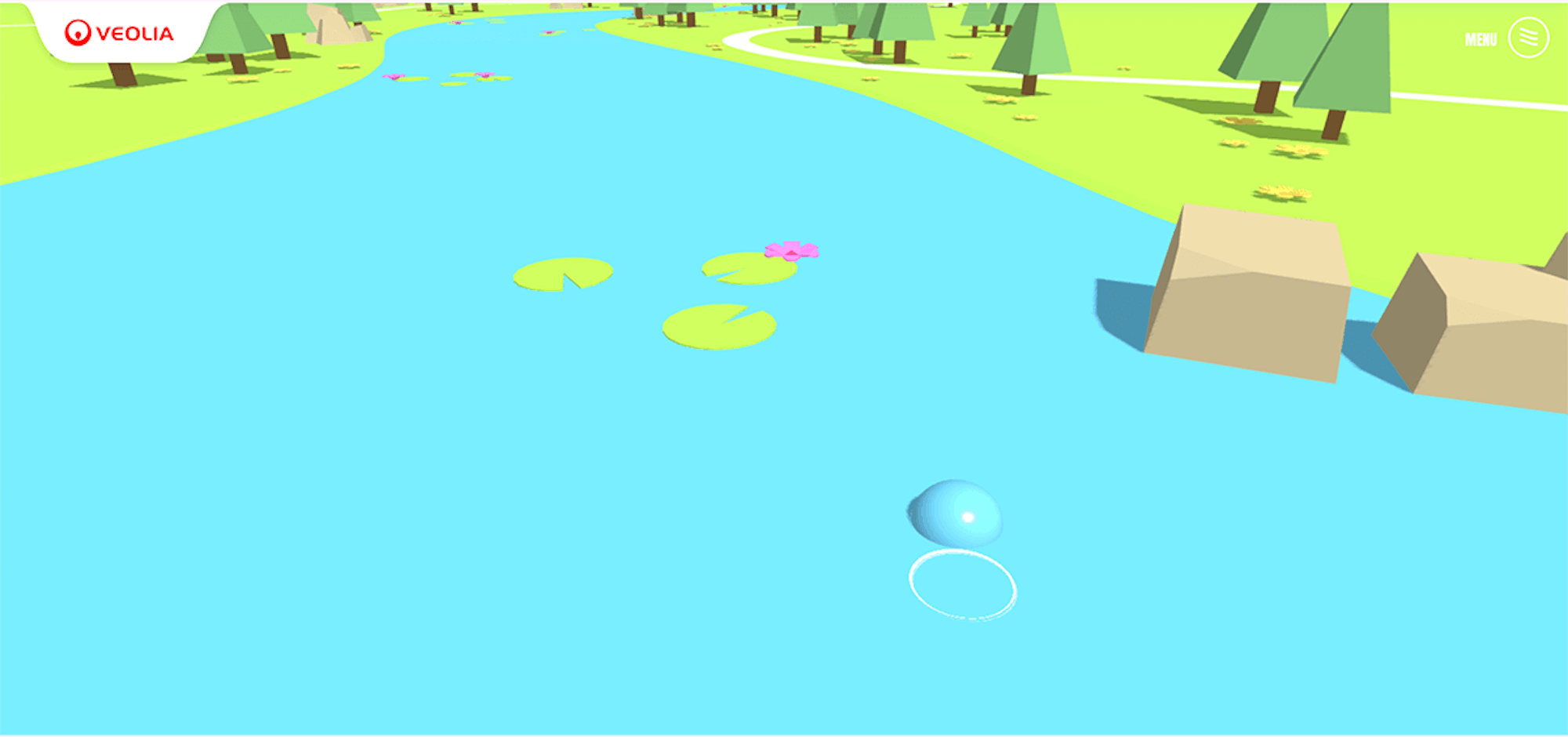
- Tell a story through gamification - Gamification has been the buzzword of 2018 and uses game design mechanics to engage audiences and enhance their overall experience online. Take a look at the fun way Veolia play with this idea to show the journey of a water drop in their production of portable water.
Going bold may not fit everyone’s aesthetic or design preferences. But you don’t want to please everyone, anyway. A great website means creating memorable, engaging and relevant experiences to the specific group of people your business wants to talk to (find out more about creating Brand Personas for your brand here.)
By pushing boundaries and bending rules, your boldness can cut through the internet noise and connect you with the people who need your services the most.
If you’re feeling inspired to start thinking differently, check out this TED talk by Adam Grant on “The Surprising Habits of Original Thinkers.”
Then get in touch with the Bigger Picture team to talk about your next bold idea…