
Many designers and creative agencies don’t actually follow a UX focussed process. The UX of your website is not just about how pretty it looks, it’s how someone navigates it, how they feel when they ‘click,’ and how easy you make it for them to engage with your content.
In this article I’ll be explaining what UX design really means and how we do it at Bigger Picture.
UX Design vs UI Design
UX design refers to the term User Experience Design, and UI design means User Interface Design. These terms are often mistaken to mean the same thing, and I’m going to explain why this shouldn’t be the case.
UX and UI design are crucial to developing a digital product but both elements refer to very different parts of the creative process.
- User experience design is the process of enhancing user satisfaction by improving the usability, accessibility and pleasure provided by the interaction with the digital product i.e. your website or app.
- User interface design is the process of making design interfaces in software with a focus on looks and style (NOT how people interact with them).
Put simply, UX is how things work and UI is how they look. It doesn’t matter what your site or app looks like if people struggle to interact with it, so UI without UX consideration is a risky tactic and often leads to design features that are not suitable for the target audience. First impressions matter when it comes to your brand and website, users decide in just a few seconds whether your site or app is worth their time so you better understand exactly who your audience are and what they want.

Value your users
At Bigger Picture one of the first things we get across to project stakeholders is that the new website or app is for the customer, not the people in charge of signing off design. If you love Ford’s but all your customers are Kia fans, I’m sorry but you need to learn to love Kia. Fonts, colours, imagery, functions and layout should all be optimised for the target audience. That is UX design.
Load times
The quicker your site or app loads the better. The biggest reason for high bounce rates is due to slow loading times. Your visitors don’t have 10 seconds to spare waiting for your site or app to load, they have stuff to do. With this in mind, make sure you build your product to be as efficient as possible.
This doesn’t just involve loading speeds, if your site is asking them to go through several, meaningless steps before they get to the content they’re seeking, then they will just leave. Make sure that sign-up forms are quick to complete, too much information is wasting their time.
At Bigger Picture we analyse data to see what devices your traffic is using. It doesn’t take a rocket scientist to work out that high mobile visits from 3/4G require a different design tactic to those targeting people in front of office PC’s. Knowing the type of devices your audience use means we can optimise the design for them.
Errors
We’ve all been there. There is nothing more frustrating than a website that won’t let you checkout, submit a form or view the piece of content you desperately want to read. Doing everything you can to provide an error free experience goes a long way in the overall user experience.
We spend hours upon hours running through quality assurance before launching a website and post-deployment, keep a close eye on logs and Google Search Console. Managing errors, especially during a website migration needs to be carefully planned so make sure your design or development agency have you covered.
Clear instruction
People are much more likely to feel at ease when they know what they are doing, clear instructions provide confidence to users and help reduce the chances of them feeling dumb, leaving your site, and going to a competitor.
We work with our clients on micro messaging, something often overlooked in web design in general. Your copywriter is unlikely to provide content for filling in credit card info correctly, and even if they do, sometimes instructions are best left to creatives. A good example of this is something we’ve recently introduce at Bigger Picture. Rather than typing payment instructions we’ve illustrated it – you can see something similar at https://codepen.io/supah/pen/OMdPpW. Highlight form errors in real time, showing alternative search queries instead of no results found and generally being helpful goes a long way with UX, and SEO too.

What a UX designer actually does
A UX designer’s role is to make a product usable and enjoyable for its users, but what do they do on a day-to-day basis? It’s probably important to say here, a UX designer does not have to be super creative. A lot of the UX work does at Bigger Picture is done in collaboration with the creative and strategy teams.
Our approach to UX design changes for every project as a fixed process can’t work for everyone. Each project is unique and requires a tailored approach. A 1,000-page ecommerce site is way different to a 5-page microsite and every app we touch has different objectives.
1. Research
Research is the starting point to most, if not every project there is, and UX designers are no exception to this. Proper research provides the starting point for a great design, allowing designers to avoid assumptions and make accurate decisions based on the information.
Our research tends to include:
- Interviews with employees and customers
- Competitor analysis
- Google Search Console and Analytics analysis
- Persona analysis
The information gathered through research is used for decision making through the process of the design. We get to understand the brand, its competitors and most importantly, the people we are designing for.
2. Giving your users a persona and creating scenarios
Personas are one of the most important processes for us and most UX designers. Creating fictional characters that make up your clients now and what you want them to be helps define a strategy. Age, personality, goals and frustrations are used along with motivators to help prioritise website features and decide what content sits where. We normally create three or four personas that will all take different journey’s through the website to come to that ultimate conversion decision.
3. Information Architecture (IA)
After the research has been done and the personas have been created, a UX designer will have to define the Information architecture. Information architecture is the process of organising, structuring and labelling content in an effective and sustainable way.
For example, we’ll normally sketch out a navigation bar to help users understand where they are on the site. It does of course go way beyond nav bars. How different pieces of content link together, how we’ll signpost them and create a UX focussed journey is harder than it sounds but so worth it. Increasing page views, time on site and engagement leads to better conversion rates.
I will be going into a lot more detail about Website Information Architecture in another article very soon.
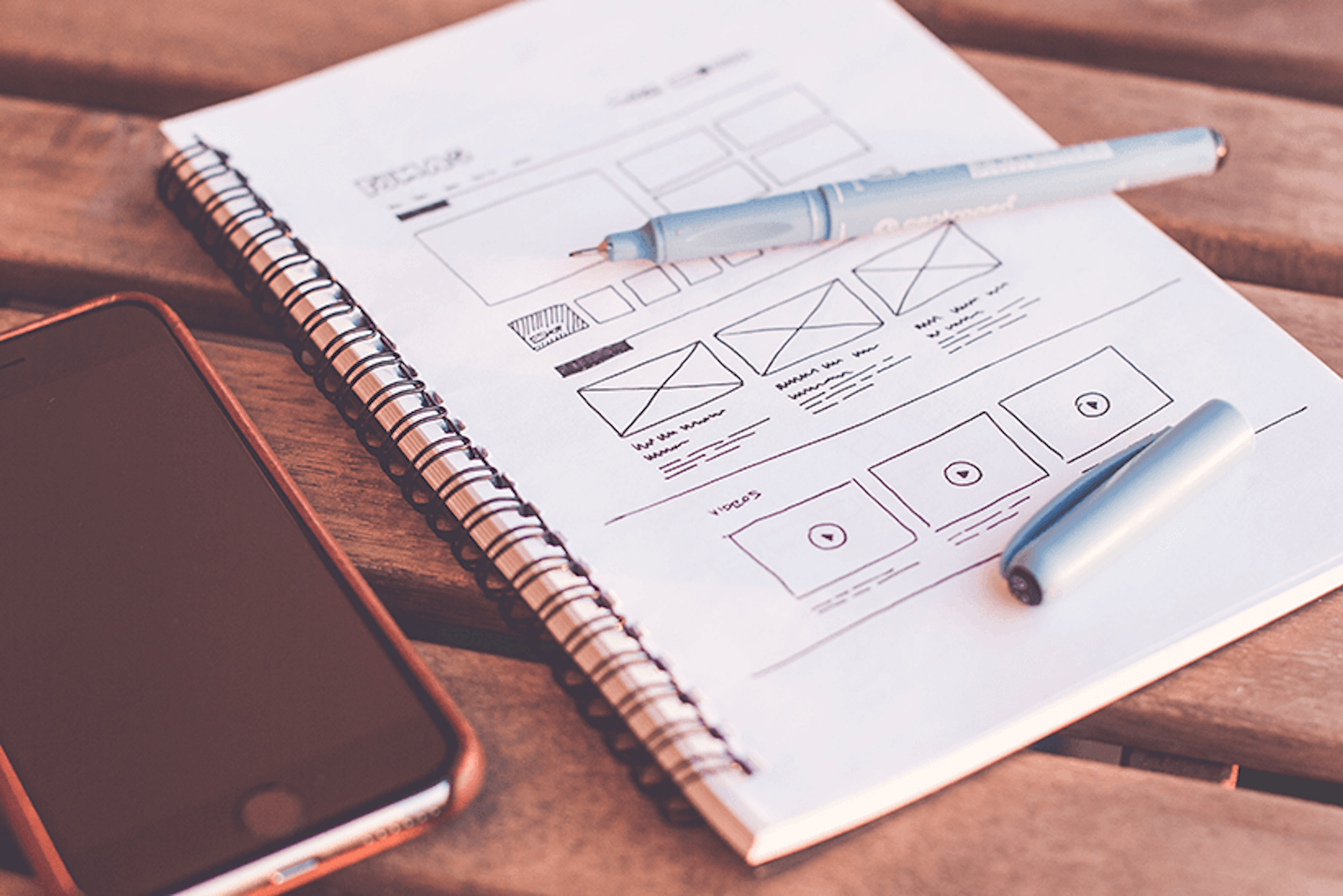
4. Developing Wireframes
Creating a wireframe is the next step for a UX designer. A wireframe is a visual representation of a user interface. It is used by UX designers to determine the hierarchy of items on screen and decide what items should be on that page based on the user’s needs.
An easy way to think about a wireframe is comparing it to building a house. Every house needs a floor plan to ensure that it functions well, and the occupants are happy with everything. The same goes for a website or app, a UX designer needs to plan the basics before it can be made to look pretty.
On occasion our team sometimes skip a wireframe process and jump into prototyping. In the nicest way possible using my above analogy about a floor plan, some website are like building a card board box. The best-looking card board of course.
5. Creating prototypes
Prototyping is used to represent a good idea of how the final product will look and interact. When demonstrating an interactive design, there isn’t much point in showing the customer a static image. I am gobsmacked at how many creative agencies still use this approach. If you ever see me print out a website, please shoot me! You can’t click, hover, swipe and interact with a piece of paper or static image. If that’s what you get in a prototype, then please call me now.
Prototyping properly will give you an almost finished product look and feel. We do prototypes directly in browser, using disposable code. It’s creative development at its finest and how we believe our projects stand out from the crowd. Doing this also means there is no room for miscommunication or understanding between design and dev teams. Giving a static design to a developer and say make it come to life is probably their worst nightmare.
6. Testing
Testing the website/app helps the UX designer discover problems that users may experience when engaging with it.
A good way to conduct testing is by observing a user’s behaviour in person as they use the website. A UX designer can use what they have discovered to adapt the design and improve user experience. As time goes by and more data collected, UX improvements should never end. Improving things like bounce rate, pages viewed and time on site is something we constantly do for our projects.
Evaluating a current system
If there is a system already in place, a UX designer will evaluate its current state in detail. Any issues will be reported, and fixes suggested based on their analysis of research data.
A/B Testing
A/B testing is used to evaluate the effectiveness and quality of experience between different user interfaces.
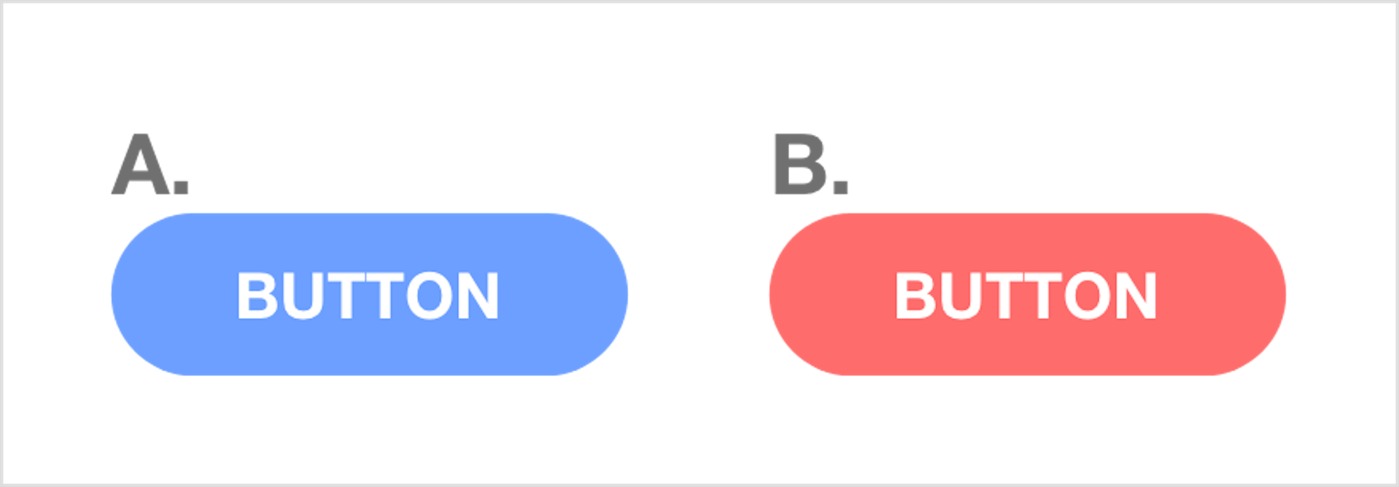
This test is done by coming up with a hypothesis. For example, “A green button is more appealing than a red button”. Then creating multiple versions and conducting the test. If the hypothesis is correct, and the green button should see more clicks, the test is over and green button put into production.