
Web Design is subjective. A perfect anatomy doesn’t exist?
Sure, we can buy into this. What you love others may hate. The home page design might be the first part of the creative web design process, but it’s not the first part in the entire process. Your website needs to go beyond design and creativity to be truly successful. The messaging, content, navigation and paths to conversion are equally important and should be thought through before the web design starts. Most digital design agencies like Bigger Picture will start a website project with discovery sessions and workshops. They’ll also do a lot of research to truly understand your audience, competition and brand values.
Only when this knowledge exists can you produce the perfect home page anatomy. The perfect anatomy paired with creative design will benefit your brand and help your business grow.
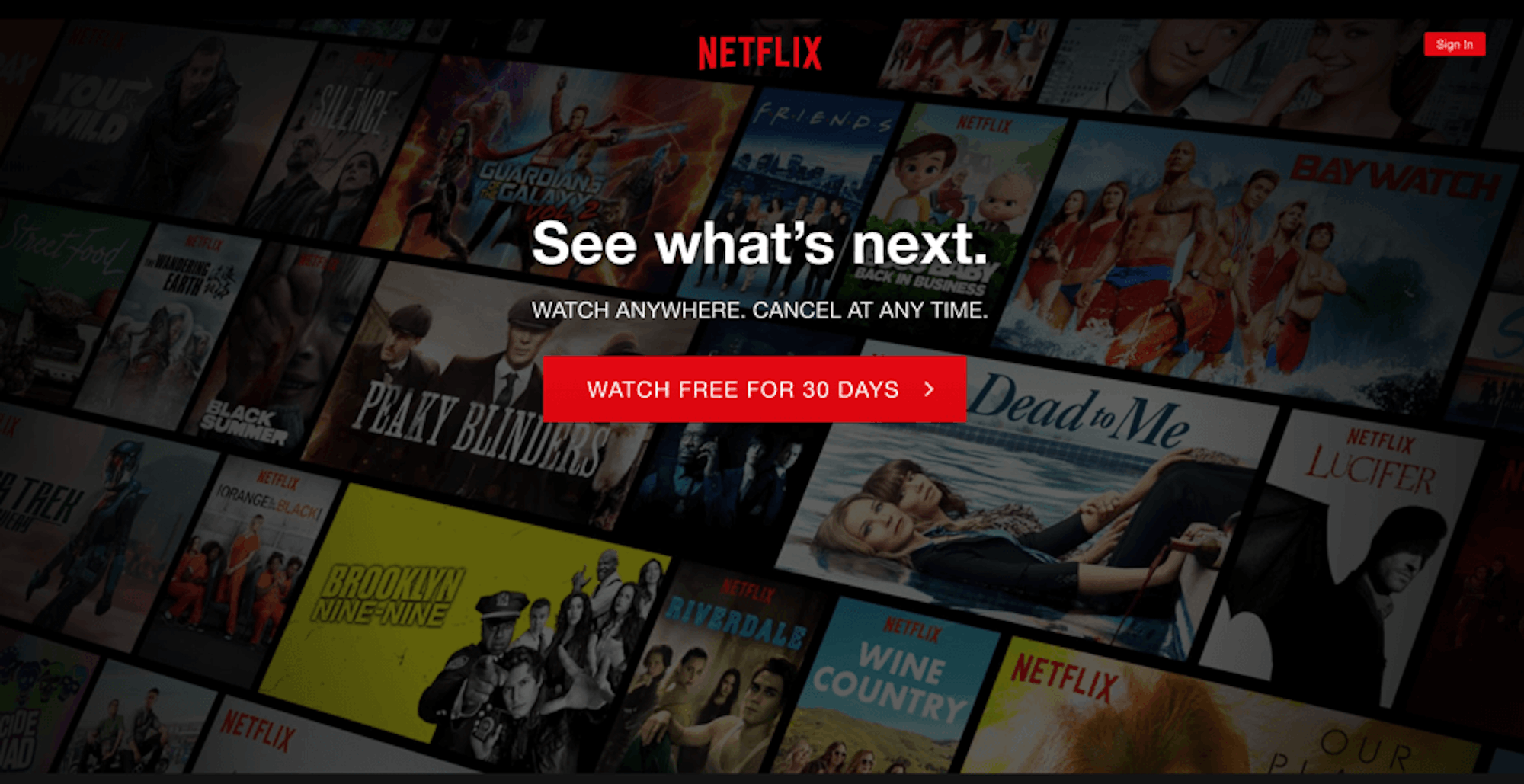
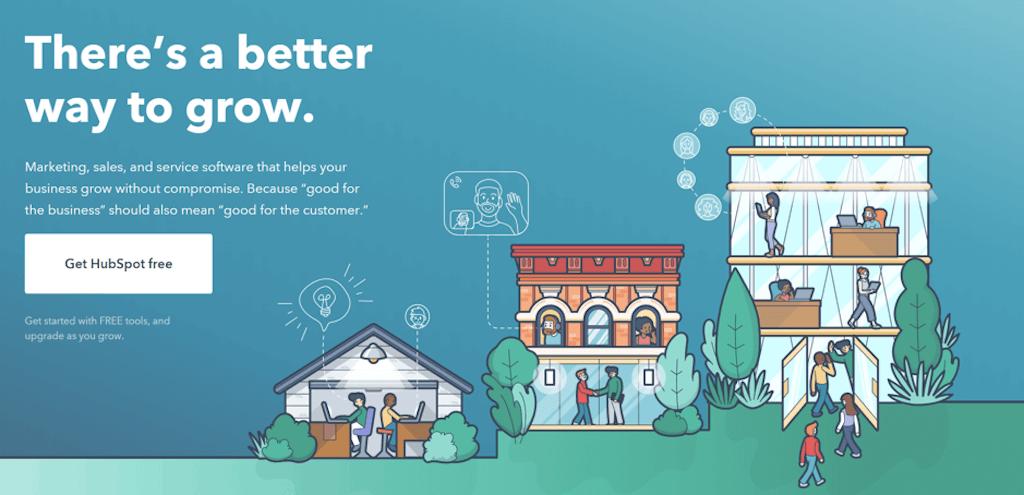
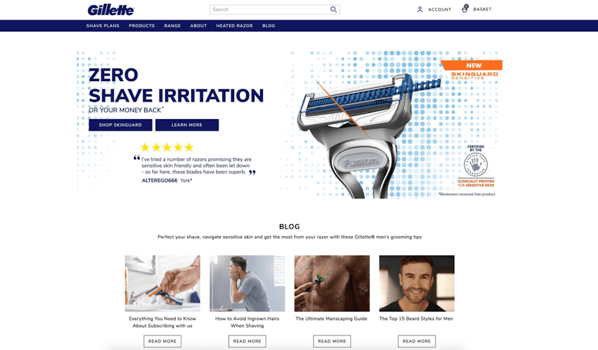
Value proposition
When creating your value proposition, keep in mind it’s going to be the first piece of content this user will read on your website. It’s the opening statement, the main headline and needs to have impact. And remember, you have only a few seconds to engage your audience. Make it clear as to what you do, how you can help and the benefits of choosing YOU over the competition. It’s not time to go abstract – nobody has time to read thousands of words before they can work out what you can do for them. If you don’t make it clear your bounce rate will be through the roof.
Your value proposition is an important part of your sales message and can make or break the success of your website. If you can’t summarise what your business does in a sentence, you need to do some work. All good creative agencies will be able to work with you and collaborate to produce your value proposition. Bigger Picture cover value proposition during workshop time and will create something that perfectly fits the attended brand.
The way your value proposition is presented as part of your design is super important too. Catch your visitor’s attention, make them interested in reading what you have to say, and the chances are, they’ll remember your brand.
At Bigger Picture we break down a value proposition into 4 areas.
- Attention grabbing headline
- Sub statement to say what you do
- Visual representation to help engage and explain
- Call to action, prompting the user to do something


Navigation
Your navigation is a site-wide element (most of the time) but it is super critical on your home page hence its place on our perfect home page anatomy list. When someone reads your value proposition and wants to learn more about a specific offering, they may jump straight to the navigation and miss all the other great content on the home page. Your navigation needs to be intuitive across desktop and mobile and designed to effectively take your users into their area of interest with minimum fuss. Whether it’s a traditional mega menu, super funky burger menu or one that’s stuck to your page, make sure your labels are clear and keep usability simple.

Thoughtful CTAs
70% of small businesses fail to out-line clear call to action buttons, potentially missing out on a lot of business. Don’t fall into this percentage! Call to actions (CTAs) are designed to help your user to take action. Normally presented using buttons with high contrast to the page they are sitting on, they should stand out on screen and have a clear, powerful message. You need to be clear and straight forward with your CTAs, get your point across and let your audience know exactly what you want them to do. Use power words like buy, free, or now and be clear on what you want your visitors to do. An example would be ‘Download FREE Today’
Social Proof
Social proof is a psychological and social phenomenon where people look at the actions of others as assurance/proof that the decision they are intending to make is correct. Nearly 90% of consumers read reviews.
What does this mean in terms of web design you ask? Establishing credibility. When a user lands on your website (typically your homepage) they want to see proof from other humans that you are a reputable company who delivers on their promise. Depending on what your business has, the web design execution can look like:
- Customer testimonials
- Certifications
- Social media mentions
- Ratings and reviews
- Case studies
- Customer/App Stats

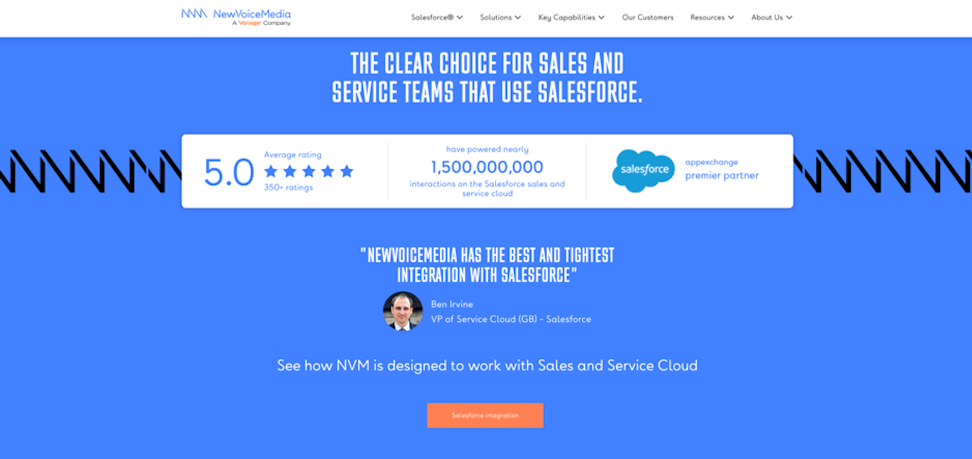
The concept of social proof has been around for quite a long time and is still a very important factor to include when optimising your home page. When you see stats like testimonials can increase conversions by 34% and 84% of people trust online reviews as much as personal recommendations, it’s hard to disagree with the fact that social proof is worth showing off to your potential customer. When we have strong stats it’s our job as web designers to ensure they stand out on screen so people see and absorb this powerful messaging.
Recent activity
Showing recent activity on your homepage goes a long way with your users. Displaying recent tweets, latest news and blogs, or featuring an active campaign will capture the attention of visitor’s and immediately put their mind at rest. There is nothing worse than going on to a website and seeing the latest blog was from 2015. It makes me wonder if they are still in business and I can’t help but doubt their ability to ‘deliver.’
Being active in the digital world gives your brand an opportunity to share knowledge and connect with your potential buyers. You’ll benefit from an SEO point of view and generally improve your engagement. Stay silent and you are just another faceless brand who can’t be trusted. If you struggle with resource, as many do, digital agencies like Bigger Picture should be able to help you create content and spread it across your social channels. Copywriting, social media management and campaign creation is something we do an awful lot of for our customers.


User-focused copy
Without a doubt, any sort of marketing is more effective when created for the intended audience, and your home page should be no different. Create personas and identify questions/pain points that your audience will have, then highlight them throughout your homepage. You’ll see more visitors turn into customers when you tackle things heads on. Don’t be afraid to talk to your customers and have an opinion.
Moving away from the homepage for a second, the user-focused part of digital applies for all content and design in general. Create copy with your audience in mind and you’ll see great results. Design using fonts, colours and styles appropriate to your audience and they’ll appreciate it. Everything we do as designers is for the audience and it’s important you don’t forget that.

Quick links into key areas of site
When a visitor enters your website for the first time, they should be able to get to what they are looking for quickly and easily. On average, visitors will spend 10-20 seconds on your homepage. So, include sign posts into key areas of your website from your homepage and visitors can quickly choose the best path for themselves – a great user experience (UX). A rule of thumb we use in order to conform to UX best practice, is that users should be able to navigate through your website without even needing to use the main navigation.


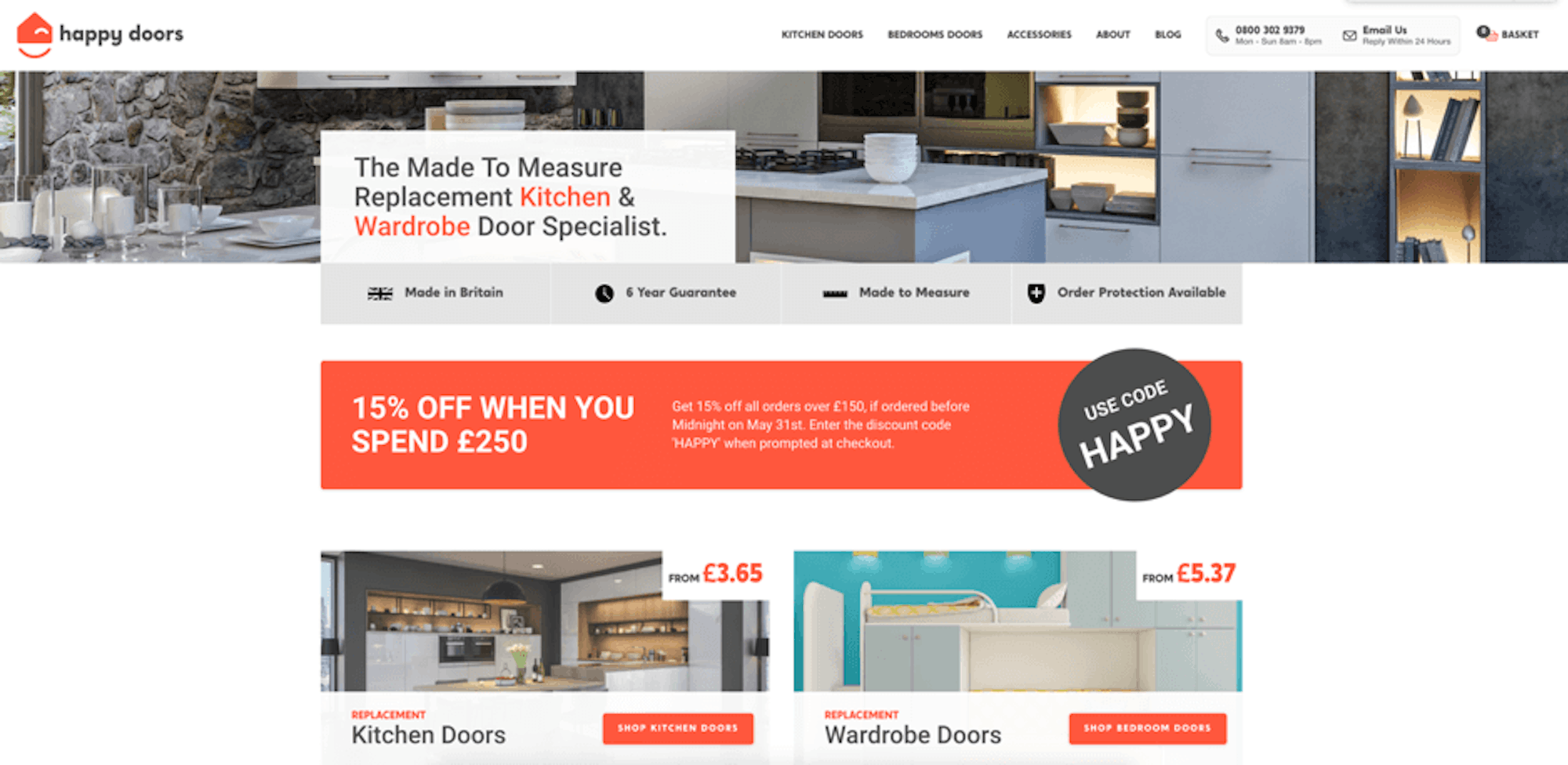
This example from Happy Doors (web design by Bigger Picture of course) is perfect. Using clear design and CTAs, we give their potential customers the ability to go straight into browsing their products from the homepage. This way, anyone that lands on their homepage knowing that they want to purchase replacement kitchen doors can go straight into browsing the products of interest and will be a lot less likely to bounce. Paired with the value proposition, people can clearly see that Happy Doors provide exactly what they’re looking for. Having these sign posts will give your users the opportunity to dive straight in and find what they are looking for without a painful search. This goes for non-ecommerce websites too of course. Listing your services means people can jump right into the area they want to learn more about without having to click the navigation.
Visual hierarchy
When it comes to web design, less is usually more. If you have 10 CTAs/signposts in the same area of your homepage, your visitors will have too many options to choose from, become confused and bounce. Designers need to put themselves in the audience’s shoes, empathise with how the user may be thinking and design accordingly. - User Experience design needs to be taken seriously. It’s not about pretty layouts but how people feel when interacting with your home page design.
Visual hierarchy isn’t just about the design choice of showing X number of nav items or services on a page though. It’s about making hard decisions and prioritising some services/products over others. You can’t give the same prominence to 100 services/products on a page. Do the research, experiment and never overload your options.
Limit the options you give your users and guide them through a journey. You’ll see a smaller bounce rate, a greater average time on site and a better conversion rate. I promise!
Contact information
This may not apply to all, but for most websites making the contact information prominent will help drive leads. It’s a simple ingredient but often forgotten. Web design teams need to think about how the customers may want to reach out and ensure they make it easy for them to do so. It may be creating a call hyperlink on a phone number will help or perhaps people want to reach out via social channels. People visit your address? Make sure your address and directions are a click away and easily found.
Search bar
Again, not a functionality that everyone needs to include when thinking about a home page design, especially on websites that only have a few pages. However online stores, content-heavy and resource led websites should include a search bar to help visitors who know exactly what they are looking for. When there are thousands of products or lots of content to explore the search box will make or break the overall user experience.
Something to note, a search bar that doesn’t perform well is going to hurt the user experience more than not having one at all. If your search bar isn’t giving accurate results or you have to type in the exact product name or code for a result to appear, people are going to become frustrated and leave. Make sure that if you are including a search bar that it’s clear and helpful to the user. At Bigger Picture we use a number of search tools depending on the job. Elastic Search and Algolia are platforms we can recommend for most jobs though. The right design execution paired with Google-like search results are what people expect. Anything less and you’ll be harming your brand.

To summarise
Your home page may be the first impression a user has of your entire business, so make sure you provide a memorable user experience for all the right reasons. Invest in a good digital/web design agency that will discover, plan and design the best home. Execute the points we mention in this article properly and you won’t go far wrong.
If you’d like us to plan, design, develop and market the perfect website for your business then we’d love to hear from you. Bigger Picture is based in Basingstoke, Hampshire and has been delivering award-winning website design for brands throughout Hampshire and London since 2005.