

75% of consumers judge a brand’s credibility based on its logo. The combination of colour psychology and logo design is crucial for a brand’s reputation. The average frequency of a logo redesign among major brands occurs once every seven years.
With 2025 well underway, several brands have already embraced fresh visual identities to stay relevant. Many companies are now opting for more subtle, purpose-driven rebranding with minimalist designs and inclusive visual identities.
So, what are some top rebrands of 2025 so far?
How logo simplification is shaping brand identities in 2025
Minimalist logo design isn’t new but in 2025 brands are stripping logos down to their essentials. This is particularly apparent in digital applications, where clarity, adaptability and recognisability across screens are key.
Uber
Uber is a prime example of this. The new design is more modern and versatile to use across different platforms and media. The sleek and adaptable look of the logo gives Uber a visual identity that aligns with its evolving brand mission.

Eventbrite
Eventbrite has also made a logo update in 2025. The lowercase ‘e’ has been replaced by a new monogram resembling thickly daubed paint. The shape was designed to symbolise the journey from discovery to memory making. The new logo, named ‘The Path’ is customisable and designed to come to life to capture the essence of different communities, such as food, music or art.
The colour has also been updated to a brighter orange to bring more energy to the brand. The brand refresh and the components can be flexibly combined across all their brand touch points, from digital platforms to event promotions.

Benefit
Benefit, a cosmetics brand, has also made changes to their logo, removing ‘San Francisco’ from the tag line. This change was done to support their global ambitions and make the logo more universal.
They have also changed their logo colour from pink to black, giving a more mature and gender-neutral look for 2025.

Mountain Dew
Mountain Dew is set to reveal their logo rebrand in the summer of 2025. They are embracing nostalgia, the updated logo blends retro elements from the 90s with flat design principles. Creating a look that feels both familiar and digitally refined.

OpenAI
One final example, although there are many, is OpenAI. They underwent a full rebrand, updating their logo, colour palette and even creating their own font.
They have introduced cleaner lines to their logo. Their new font, according to the brand, ‘combines geometric precision and functionality with a rounded, approachable character’.
These successful rebranding examples showcase how logo simplification can reshape a company’s brand image to their customer base and make them stand out against their competitors.

How UK brands are transforming their image in 2025
While global giants are redefining their image, UK-based institutions and companies are also embracing rebrands to stay relevant and resonate with modern audiences.
One of the most recent rebrands in the UK came from the Italian restaurant chain Prezzo. Or now “Prezzo Italian”. After closing many restaurants a few years ago, the chain has now launched a new name, menu and brand identity to revitalise the brand.
Royal Ballet and Opera House recently rebranded by updating their logo, as well as adding the ‘and’, now becoming ‘Royal Ballet and Opera House’ rather than ‘Royal Ballet Opera House’.
Their font within the logo has been made bolder to draw attention, whilst the coat of arms has been brightened and more contrast added to see the details better.

Branding updates for a digital world
Not all brands are undergoing major overhauls, some are making smaller, quieter updates to stay digitally relevant.
- Coca-Cola has adapted its iconic logo for dark mode, optimising visibility without sacrificing brand recognition.
- Warner Bros. has added 3D depth to their logo, creating a cinematic feel that aligns with the entertainment industry.
- Lego introduced a dynamic, interactive logo that changes based on user interaction. This reinforces its playful, imaginative brand identity.
- YouTube also made a subtle update to its logo. Tweaking their well-known red to a pinker shade. They mentioned through research that the colour was one of the most outdated elements and knew evolving this would create a strong impact.
- Adobe similarly tweaked their logo and colour palette to sharpen their visual identity and to make it more adaptable.
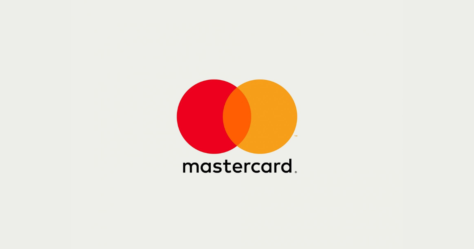
- Mastercard, though rebranded in a previous year, continues to influence with its minimalist two circle design. They simplified their logo to reflect their evolution into a digital and modern payment system.
- Pepsi’s 2024 refresh also continues to resonate in 2025. With a more digital-first look, the redesign keeps their signature colours but with sharper lines and stronger symmetry.
- Mazda switched their 3D logo to a flatter, more streamlined design. Their reasoning behind this update was to bring it into the present and be optimised for smartphones and digital displays.
Recent favourite rebrands from our design team
Our design team have shared some of their favourite rebrands from the last couple of years, along with their reasons for it.
Decathlon
One favourite rebrand from our team was for Decathlon. The new identity shows impressive continuity across icons, typography and iconography, creating a unified and instantly recognisable visual language.
The image and video style pairs beautifully with a minimal website and marketing approach, conveying a sense of simple adventure. It shifts the focus away from overwhelming product choice and toward actually getting outside and using the gear.
The refreshed blue feels clean and modern, offering a strong contrast against white. It works seamlessly with the bold new neon green accent. It is a confident evolution for a brand that champions accessibility, energy and movement.

Lloyds
The new typeface introduced in Lloyd’s rebrand strikes a balance between sophistication and modernity. It has a timeless quality and the shapes within the letterforms are cleverly echoed throughout the wider visual identity. This creates a cohesive and well-considered system.
The refreshed colour palette feels both vibrant and fresh, offering strong contrast while also demonstrating a masterclass in creating harmony within a diverse range of tones. It is a bold yet elegant evolution that brings new energy to a trusted, established brand.

Key trends for logo redesigns in 2025
If you are looking to update your logo, or branding in 2025, then here are some key trends to think about:
- Minimalism and clarity: Minimalism has dominated the industry for a while and is still a top design choice in 2025. Simplicity allows you to appeal to various audiences while getting your messaging across.
- Custom typography: Following in OpenAI’s footsteps, custom typography can really make your brand stand out from the rest.
- Vibrant and bold colour palettes: Bright, energetic colours are replacing safer, muted tones. These palettes are particularly popular with brands targeting younger, more dynamic audiences.
- Depth and layering: Logos are incorporating depth and layering to create a sense of movement and dimension.
- Animated and dynamic: An animated logo adds motion to the brand identity. It can help reflect your brand’s personality and narrative, as well as increasing the memorability of your brand.

Rebranding in 2025
The rebrands of 2025 show that logos are no longer just static symbols. They are dynamic tools of communication. Whether simplifying for digital clarity or injecting energy with bold new palettes, companies are recognising the power of visual identity.
Your logo is the face of your brand. As a branding agency we will design a logo that is bold, meaningful and timeless. Ensuring your logo and branding works for the future and as your business evolves.
Get in touch today so we can help you tell your brand story through your logo and providing you with brand guidelines for when to use different variations.