
With the Colour Of The Year typically reflecting what is taking place in cultures across the world, and standing as a statement of the global mood, colour continues to be an important form of communication and expression.
It’s always a fascinating discussion amongst our design team about whether the chosen Colour Of The Year is likely to influence the colours we use in our digital designs (it usually isn't.)
And this year was no different, when Pantone, the experts on all things colour-related, recently announced its selection for the 2022 Colour Of The Year - an unmistakable purple hue named ‘Very Peri’, despite Pantone’s claim it is a shade of blue.
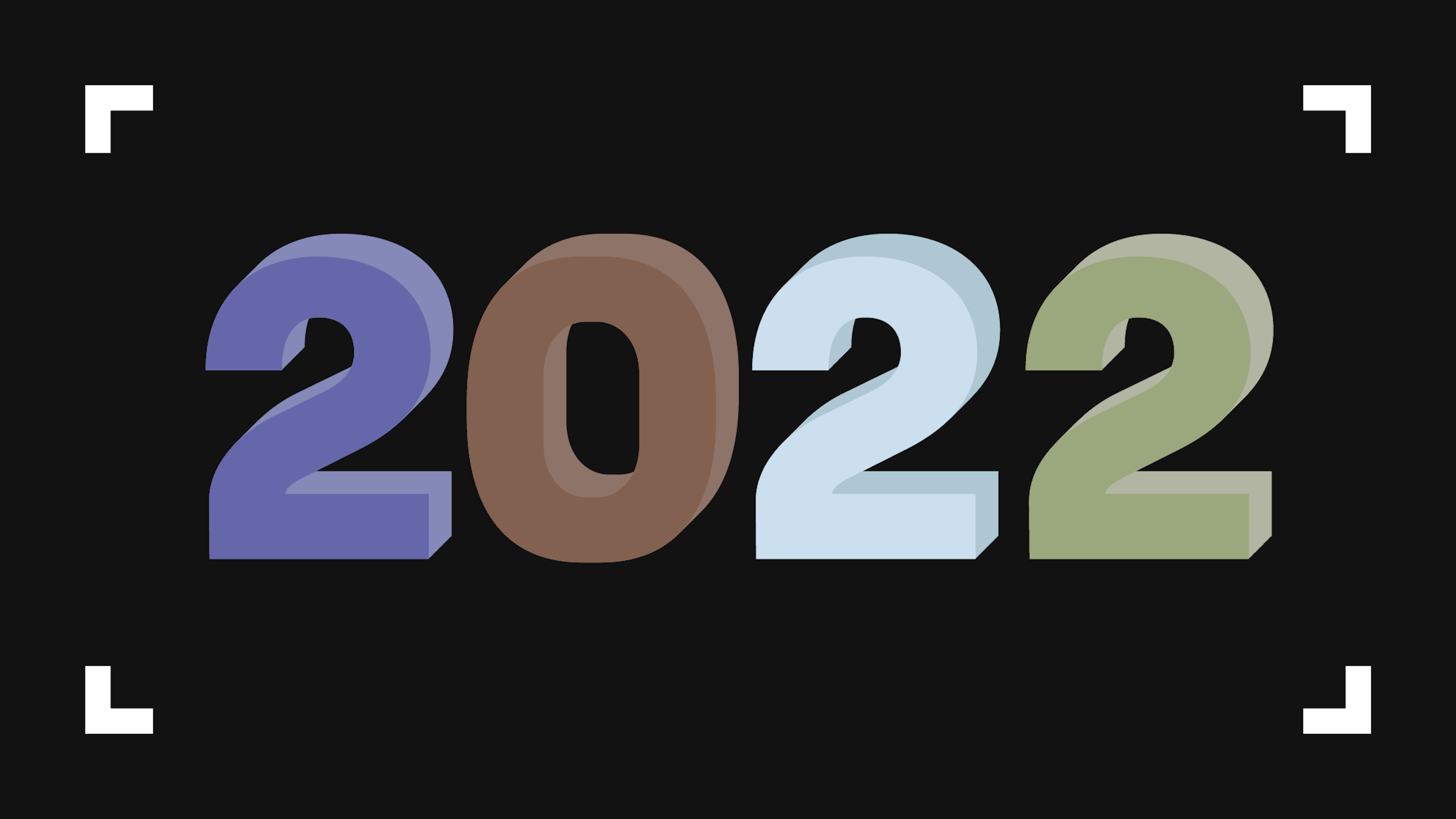
Read on, as we round up every 2022 Colour Of The Year so far.
Very Peri - Pantone Colour Of The Year 2022
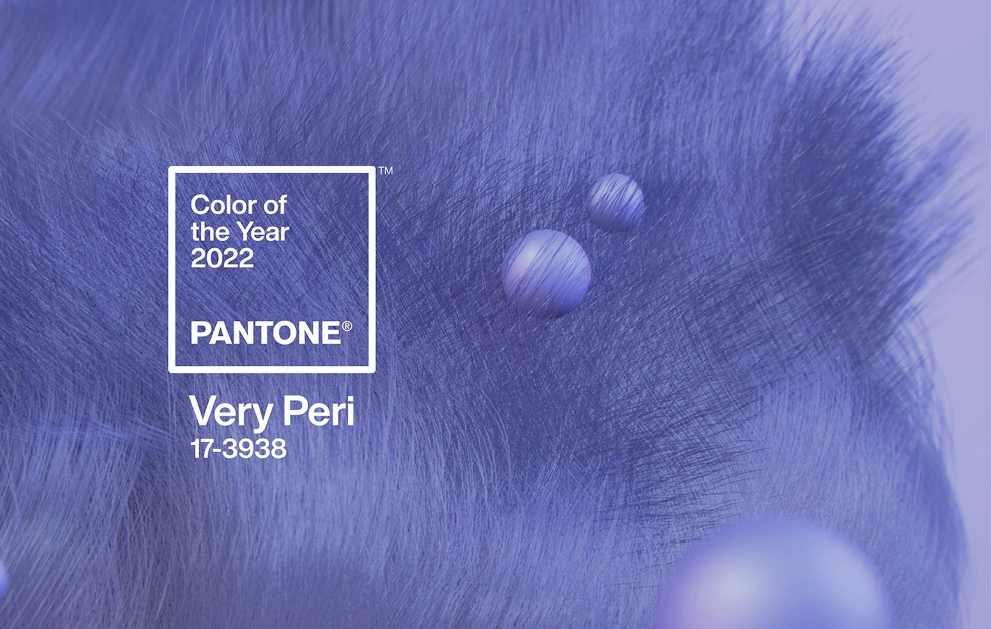
Let’s dive straight into Pantone’s chosen colour of the year 2022.
Is it blue? Is it purple? Or lilac even?
Described as a “periwinkle blue,” Pantone’s colour of the year - Veri Peri - is styled as “a new Pantone color whose courageous presence encourages personal inventiveness and creativity”.
“Encompassing the qualities of the blues, yet at the same time possessing a violet-red undertone, PANTONE 17-3938 Very Peri displays a spritely, joyous attitude and dynamic presence that encourages courageous creativity and imaginative expression.” explains Leatrice Eisman, executive director of the Pantone Color Institute.
We’ll let you make your own mind up, but we would argue that “periwinkle blue” is actually a shade of purple. Or lilac, if you want to be exact.
Bright Skies - Dulux Colour Of The Year 2022

Broadly speaking, Dulux follows Pantone’s lead with their blue-inspired Colour Of The Year ‘Bright Skies’.
Described as “a light, airy and optimistic blue that’s good for the soul. It promises to open up and revitalise your home”, Bright Skies follows key themes of open skies and a breath of fresh air, following the coronavirus pandemic.
Dulux says that Bright Skies represents the expanding role of the home, how nature is essential to our lives, how the arts can bring us comfort and inspiration, and how important it is to embrace new voices and ideas for a brighter future.
Dulux has also released 4 complementary colour palettes alongside Blue Skies, so there’s lots of options about how to match this shade.
L478 Kestrel - Tikkurila Colour Of The Year 2022

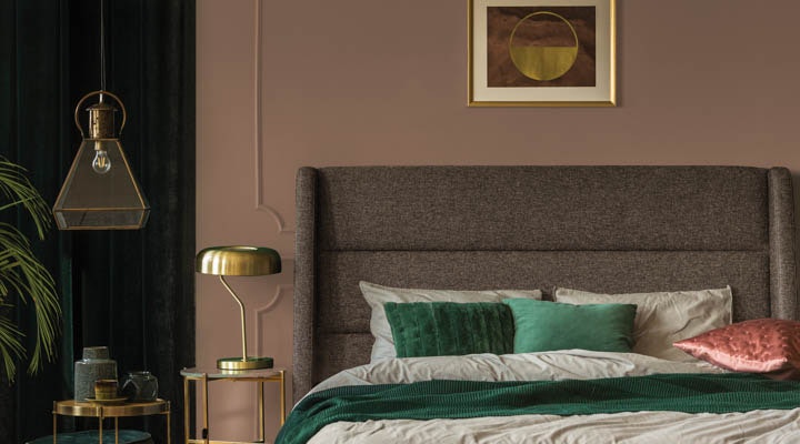
Introducing leading paint brand Tikkurila’s 2022 Colour Of The Year, a rich, reddish-brown named ‘L478 Kestrel’.
Described as “a blend of rich, warm brown with cool-red undertones - this grounding shade represents familiarity and comfort. A bold colour yet surprisingly calm and soft.”
Tikkurila takes inspiration from the falcon species of the same name, L478 Kestrel represents ‘the adventure of home.’ and ‘the unique memories and experiences that make your house a home.’
We agree that this rich brown hue is a tone of warmth, relaxation and creativity.
Valspar Colours Of The Year 2022

Rather than naming an individual Colour Of The Year, Valspar created a palette of 12 nature-inspired hues that bring calm and comfort.
Valspar’s colour experts have curated 12 trendy, timeless colours that include warm neutrals, pretty pastels, and calming blues and greens.
“Colors can power moods, energizing us with confidence, strength, and curiosity - allowing us to express ourselves with color anywhere - whether it be a full room, an accent wall, trim of furniture.” Said Sue Kim, Valspar colour marketing manager.
Here are Valspar’s 12 colours of 2022:
- Blanched Thyme - A cool, organic green
- Gilded Linen - An ultra-clean neutral
- Delighted Moon - A cheerful, modern yellow
- Lilac Lane - Uplifting and restorative
- Mountain River - A rich, dark, shade
- Orchid Ash - Refreshing, colour-infused white
- Grey Suit - Elegant and balanced
- Subtle Peach - Soft and light
- Rustic Oak - A rich, warm colour
- Sunset Curtains - Subtle, quiet, soothing
- Country Charm - A cozy, neutral shade
- Fired Earth - Dark and approachable shade


Art and Craft - Dunn-Edwards Colour Of The Year 2022
Dunn-Edwards Colour Of The Year
We see nature-inspired colour trends appear again with Dunn-Edwards’ Colour Of The Year ‘Art and Craft’. It’s a warm, earthy brown hue that’s not too dissimilar from Tikkurila’s ‘L478 Kestrel’.
"Art and Craft is truly a down-to-earth color that signifies stability, comfort, and calm, a color that expresses what we all seek right now," says Sara McLean, colour expert for Dunn-Edwards.
Web design from the experts
As a web design agency, we know that just because a colour is predicted to be a hit in your home in 2022, it doesn’t necessarily mean it will be the same for your website.
Thankfully, we have a team of expert designers who know which colours look good and what design aspects will work for your website.
If you’re looking for a brand refresh in 2022, then let’s talk. Get in touch with our expert team today.