Rebrands that got it right
-
Burger King
Whilst 2020 was pretty dire for many brands, Burger King triumphed, as they unveiled their first full rebrand in over two decades.
The new identity, designed by the in-house creative team and JKR New York, features a new logo, which pays homage to Burger King’s heritage.
The new logo favours flat design, which is more aligned with the logo used by Burger King throughout the 1970’s, 80’s and 90’s.
![new burger king logo]()
Along with an updated logo, Burger King also redesigned their food packaging, using a font inspired by the shape of its burgers and a vibrant new colour palette.
Positive reactions from the design community flooded Burger King’s social media accounts. This was a top pick amongst our own design team too!
![new burger king branding]()
It’s flat design executed in a way we haven’t seen yet from many of the big brands. The vibrant, block colours work seamlessly across digital platforms, as well as in-person.
-
Premier League
Ahead of the upcoming 2016/17 season, DesignStudio created new branding for the Premier League.
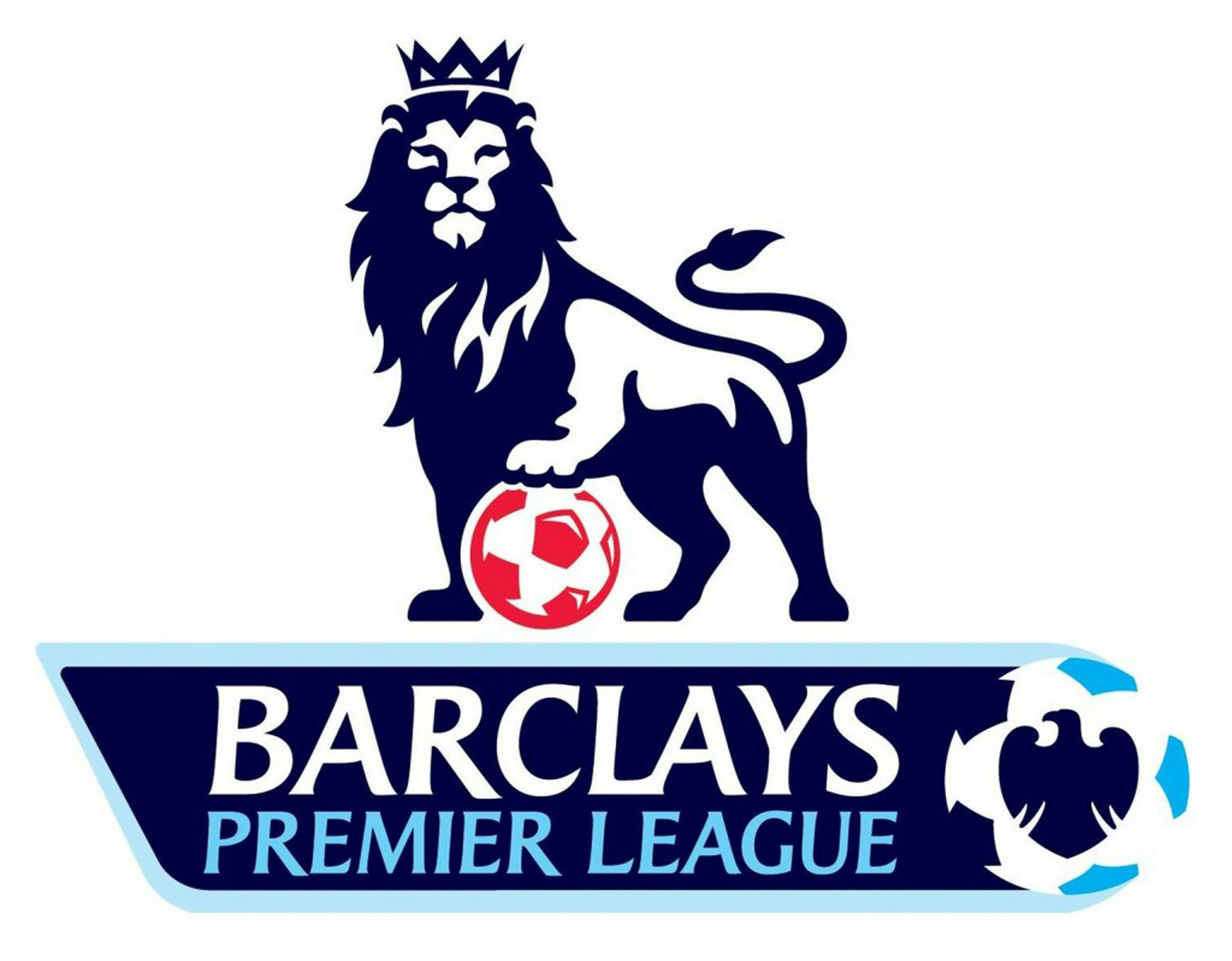
After separating from its title sponsor, Barclays, back in 2015, the Premier League decided it was time to become their own brand, and show a new side to the world’s most popular football league.
![old premier league logo]()
The design overhaul started with a modern take on the iconic lion motif. Still preserving the Premier League’s heritage, the logo evolved into a modern, vibrant graphic symbol that creates an engaging brand experience across all channels.
One of the most obvious drivers behind the Premier League rebrand is the digital-first approach that is needed by almost every brand these days.
New logos must be recognisable, but they also need to work small and fit on an app. The old Premier League logo just didn’t do that.
![new premier league branding]()
![new premier league branding on billboard]()
The rebrand has also introduced a new, more vibrant colour scheme, consisting of bright yellows, blues, greens and reds to help the Premier League come across as young, modern, fresh and colourful.![premier league logo on the floor]()
The new colour scheme is clean, bright and distinctive, and it’s a stark contrast to the traditional (boring!) white, blue and red combination we saw in the old Premier League brand. -
Airbnb
In 2013, Airbnb disrupted the world of travel as they burst onto the scene with an innovative accommodation model, and they were experiencing significant growth
Although Airbnb’s offering seemed unique, their branding didn’t.
![old airbnb logo]()
As a fast-emerging global brand, operating in every country in the world, Airbnb needed to create a brand that would be recognised everywhere.In 2014, they worked with DesignStudio to create a new brand identity complete with a bold new colour palette, typography and a modern brand symbol, named the ‘bélo’.
![new airbnb logo]()
Four members of the DesignStudio agency travelled to 13 cities to research locations, visit Airbnb offices and become a part of the community in order to fully grasp what the brand stands for.![new airbnb logo process]()
The result: a clear understanding of Airbnb's key values, a clean, contemporary brand identity, and a clever new logo. -
Uber
Founded in 2010, Uber has rebranded twice already in its brief eleven-year history.
It’s second rebrand, launched in 2016, seemed impulsive and vague, with no clear direction behind the rebrand.
The main app icon featured a square, within a circle, within another square. Sounds confusing, right? It was.
The rebrand received a great deal of criticism, with outraged Uber users taking to social media to criticise the latest rebrand.
Two years after their last rebranding disaster, and several public controversies, the pressure was on Uber to change its image, in terms of both branding and public perception, and create something fresh.
![new uber branding]()
Uber hired Wolff Olins, a London-based brand consultancy, during a time of immense change.
The new brand was launched in September 2018, alongside a new mission statement and commitment to safety.
Uber’s rebrand is a great example of how sometimes it’s not enough to just change your logo. Sometimes it takes a complete change of communication.
-
Mastercard
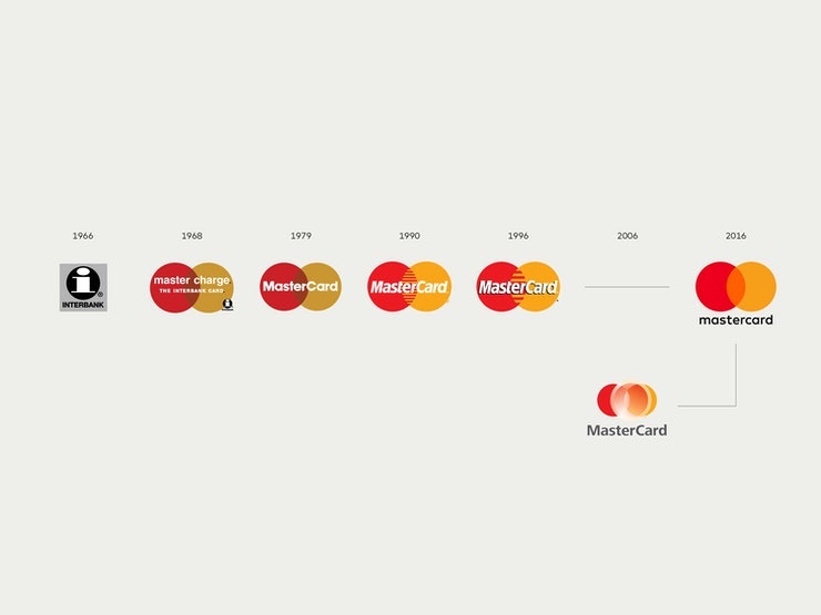
Since 1968, Mastercard’s iconic red and yellow intersecting circles have become synonymous with bank transfers and credits cards.
Its logo is currently used across more than two billion plastic cards around the world, on advertising billboards, ATMs, across digital platforms and at global headquarters.
Despite being one of the world’s most recognised brands, even Mastercard need to keep with the times and make their brand digitally friendly.
![mastercard logo timeline]()
Their most recent brand identity, created by Pentagram, stays true to its heritage by keeping the familiar overlapping circles, but has now stepped into the digital age and is ready and optimised for on-screen use.
The new logo features subtle changes, like the decision to make the “c” lowercase – a visual cue to reduce the emphasis that the brand is no longer just a physical card but can now be used as an additional of payment option in the digital world.
![new mastercard logo]()
The Mastercard rebrand was another top pick amongst our design team. We especially like the thought process behind the new brand identity, emphasising simplicity and connectivity, and is now better optimised for use in digital contexts, which is an increasingly important part of Mastercard’s business.
As of January 2019, Mastercard has gone a step further by dropping its name from the logo, leaving just the two iconic overlapping circles as its main emblem.
Does your brand need a refresh?
As a creative design agency in Hampshire, there’s nothing that gets us more excited than an opportunity to get our teeth into some exciting design projects. Rebrands included!
If your brand identity looks tired and doesn’t truly represent your company values, it’s time for change.
Get in touch with our team today and we can discuss your rebrand project – we'd love to help!